Clean Has Come to Web Templates: How “Clean” Design Took Over Shopify (And Why It Works)
Last modified: April 27, 2025
Why It’s Everywhere Right Now
The Clean design takeover isn’t a fluke. It’s a response.
We’re living through a time where:
- Everyone is overstimulated (thanks, TikTok)
- Brands are begging for attention (louder, bolder, messier)
- Trust is low, scroll speed is fast, and shoppers are tired
Clean stores interrupt the scroll not by shouting-but by offering peace.
They say, “Relax. We’ve got this. Take a look around.”
In a sea of gradient explosions and carousel car crashes, Clean is the confident exhale. And it performs really well.
Shopify Themes Doing It Best
There’s a reason Shopify started baking “Clean” into their theme styles-it works across industries and devices. Here are some top-tier themes where Clean isn’t just a style… it’s the whole strategy.
Pipeline - Clean
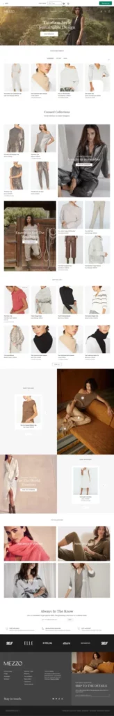
Broadcast - Clean

Impulse - Clean

Clean as a Conversion Tool
This isn’t just about “looking nice.” Clean design actually performs better in today’s eCommerce landscape. Here’s why:
- It builds trust.
Users associate clarity with legitimacy. A Clean design feels put together. If the site is clean, the business must be too. - It keeps users focused.
When there’s one call-to-action on the screen, there’s one decision to make. That’s smart UX. - It’s mobile-first by default.
Clean layouts scale beautifully. Less clutter = less friction on small screens. - It’s cheaper to maintain.
Clean themes are often faster, easier to update, and require fewer design assets. No need for wild animations or custom modules every time you want to run a sale.
How to Clean Your Shopify Site Without Losing Its Soul
Not ready to swap themes? You can still clean up your act-without starting over.
1. Cut copy by half, then half again.
Say less, but better. Let your products tell the story, and let design reinforce it.
2. Give every section its own breathing room.
White space is not wasted space-it’s how shoppers focus.
3. Use photography as the anchor, not decoration.
Each photo should serve a purpose. Big, crisp, and emotional wins.
4. Ditch extra UI elements.
If it doesn’t help someone get closer to checkout, it probably doesn’t belong.
5. Keep your color palette tight.
Three colors, max. One should be neutral. One should be action-driven. One should be ambient. That’s the Clean trinity.
Final Thought: Clean Is Quiet, But It’s Not Subtle
The Clean aesthetic might look quiet-but don’t confuse it with playing small.
In a digital world full of brands trying to razzle-dazzle their way into a click, Clean says, we’re already enough. And that confidence? That clarity? That’s what converts.
So if your store still feels like it’s throwing confetti at every visitor hoping something sticks-step back. Strip it down. Rebuild it smart.
You don’t need louder.
You need cleaner.
And if you’re not sure where to start-say the word. We’ll turn your storefront from cluttered to quietly iconic.