7 Shopify Grid Themes for 2026
Last modified: October 11, 2026

| # | Image | Name | Price | Reception | Adoption | CWV pass rate |
|---|---|---|---|---|---|---|
| 1 |

|
Broadcast
|
$420 | (283) | 1.7% | 74.6% |
| 2 |
|
Warehouse
|
$320 | (325) | 0.8% | 66.9% |
| 3 |
|
Motion
|
$420 | (557) | 0.8% | 64.6% |
| 4 |

|
Streamline
|
$420 | (335) | 0.2% | 73.4% |
| 5 |
|
Booster
|
$299 | 0.2% | 45.4% | |
| 6 |

|
Capital
|
$320 | (134) | 0.1% | 67.5% |
| 7 |
|
Loft
|
$180 | (175) | <0.1% | — |
|
Show More
|
||||||
Data first, opinion second: we track usage across 3.5+ million Shopify stores daily, and have since 2017. The stats tell us what merchants actually use; our editors rank the final picks by quality, pricing, and fit.
How These Themes Compare on Speed
| Theme | CWV pass rate | Few apps | Median LCP |
|---|---|---|---|
| Broadcast | 74.6% | 86.4% | 1.5s |
| Streamline | 73.4% | 84% | 1.6s |
| Capital | 67.5% | 83.3% | 1.9s |
| Warehouse | 66.9% | 77% | 1.7s |
| Motion | 64.6% | 71.7% | 2.1s |
| Booster | 45.4% | 50% | 2.1s |
Broadcast
Ideal for: Editorial grids with story
Broadcast is the most-used theme on this list, and it makes a strong grid because it pairs clean product tiles with editorial storytelling. Collection pages stay crisp and scannable, while the homepage leaves room for video, lookbooks, and brand narrative above the grid.
For a visual catalog, that balance matters: shoppers get a tidy grid to browse and enough story to build trust. It is fast and mobile-first, which keeps a dense grid responsive. See where it sits in our Broadcast usage data.
Broadcast Highlights:
- Clean product tiles with editorial storytelling
- Video and lookbook blocks above the grid
- Fast, mobile-first build for dense catalogs
- Strong performance for search ranking
Broadcast Usage Statistics
Broadcast usage at a glance, from our Shopify store dataset, refreshed daily.
Broadcast Page Speed: Live Data
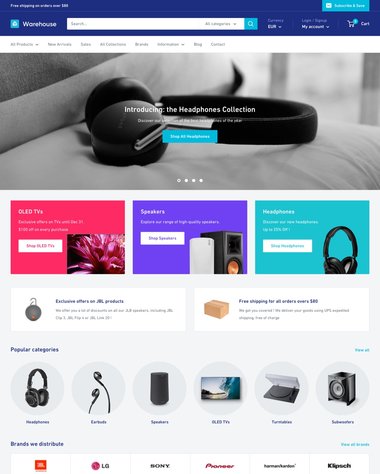
Warehouse
Ideal for: Large catalogs
Warehouse is built for large catalogs, so it handles a big product grid better than most. Multi-column menus, advanced filtering, and live search let shoppers move through hundreds of tiles without friction, which is exactly where a grid can otherwise slow down.
If your store carries a wide range and you want a clean grid that stays usable at scale, Warehouse is a proven pick in our data.
Warehouse Highlights:
- Built for very large product grids
- Advanced filtering and live search
- Multi-column menus for deep catalogs
- Stock indicators and promo tiles
Warehouse Usage Statistics
Warehouse usage at a glance, from our Shopify store dataset, refreshed daily.
Warehouse Page Speed: Live Data
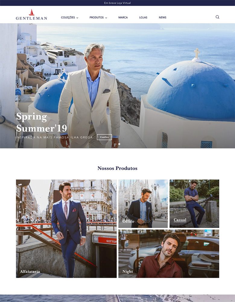
Motion
Ideal for: Dynamic, animated grids
Motion adds movement to the grid. It keeps fast-loading product tiles but layers in subtle animation and video, so a static grid feels more alive without losing speed. That suits brands that want their catalog to feel dynamic.
It is one of the more widely used premium themes in our dataset, and its video blocks help tell a product or brand story right alongside the grid.
Motion Highlights:
- Subtle animation on a fast product grid
- Video tiles for product and brand story
- Quick loading despite the motion effects
- Clean, modern collection layouts
Motion Usage Statistics
Motion usage at a glance, from our Shopify store dataset, refreshed daily.
Motion Page Speed: Live Data
Streamline
Ideal for: Fashion, image-first stores
Streamline is a popular fashion-leaning theme that works well as a grid across most niches. Its product tiles are clean and its layout stays quick, which keeps a large visual catalog easy to scan.
It is a smaller name than the top grid themes, but for an image-first store where the products carry the page, it frames them cleanly.
Based on live scan data across the Shopify stores in our dataset that run Streamline, the theme holds up in the field with a decent Core Web Vitals pass rate on real product catalogs, and its layout patterns fit image-driven categories cleanly. The live snapshot below shows its dataset share and rank, and the full Streamline store data page covers the store types and themes it runs on.
Streamline Highlights:
- Clean product tiles for image-first stores
- Quick-loading grid across niches
- Fashion-leaning design that suits most catalogs
- Simple, scannable browsing
Streamline Usage Statistics
Streamline usage at a glance, from our Shopify store dataset, refreshed daily.
Streamline Page Speed: Live Data
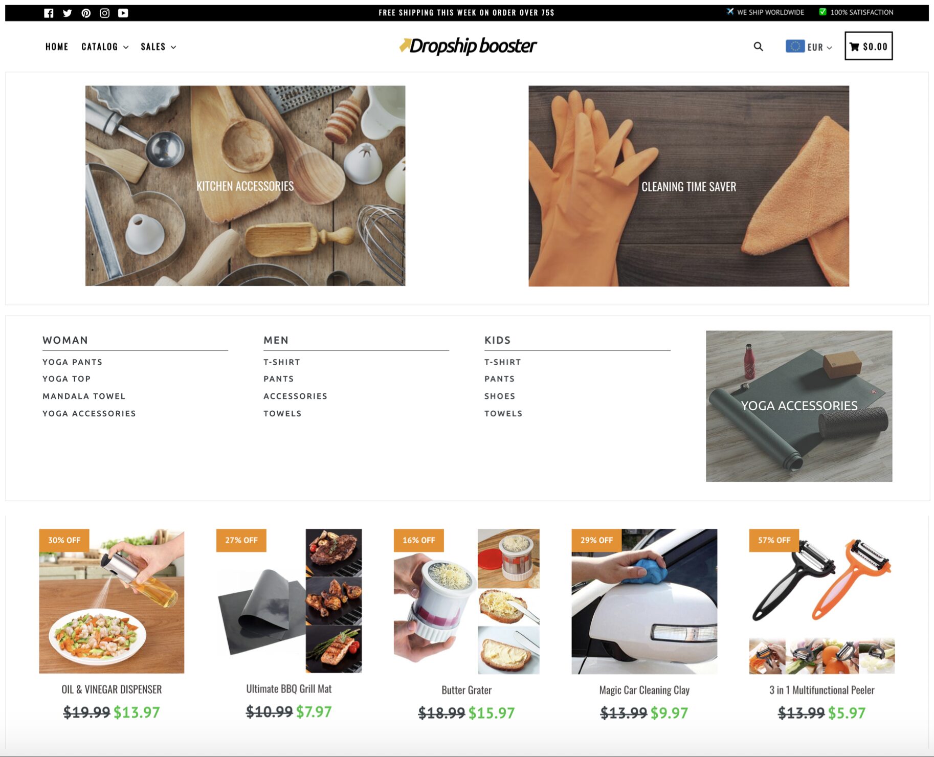
Booster
Ideal for: All-in-one visual stores

Booster gives you a clean grid plus a full set of built-in marketing tools, so you can run a visual catalog and conversion features from one theme. Currency conversion, countdown timers, and popups are native, which saves stacking extra apps on top of the grid.
It is aimed at sellers who want an all-in-one setup rather than a blank canvas, and it is fast, which keeps a busy grid responsive.
Booster Highlights:
- Clean grid with built-in marketing tools
- Currency converter, timers, and popups native
- All-in-one setup with no extra apps needed
- Fast, mobile-first performance
Booster Usage Statistics
Booster usage at a glance, from our Shopify store dataset, refreshed daily.
Booster Page Speed: Live Data
Capital
Ideal for: Design-led catalogs
Capital pairs a structured grid with strong navigation, including multi-column menus that make browsing a large catalog fluent. Its Berlin style gives the grid a considered, editorial edge that suits design-led stores.
It is a smaller presence in our dataset, chosen for how cleanly it handles a big grid rather than for popularity.
Capital Highlights:
- Structured grid with multi-column menus
- Editorial Berlin style for design-led stores
- Fluent navigation across large catalogs
- Clean, considered product layouts
Capital Usage Statistics
Capital usage at a glance, from our Shopify store dataset, refreshed daily.
Capital Page Speed: Live Data
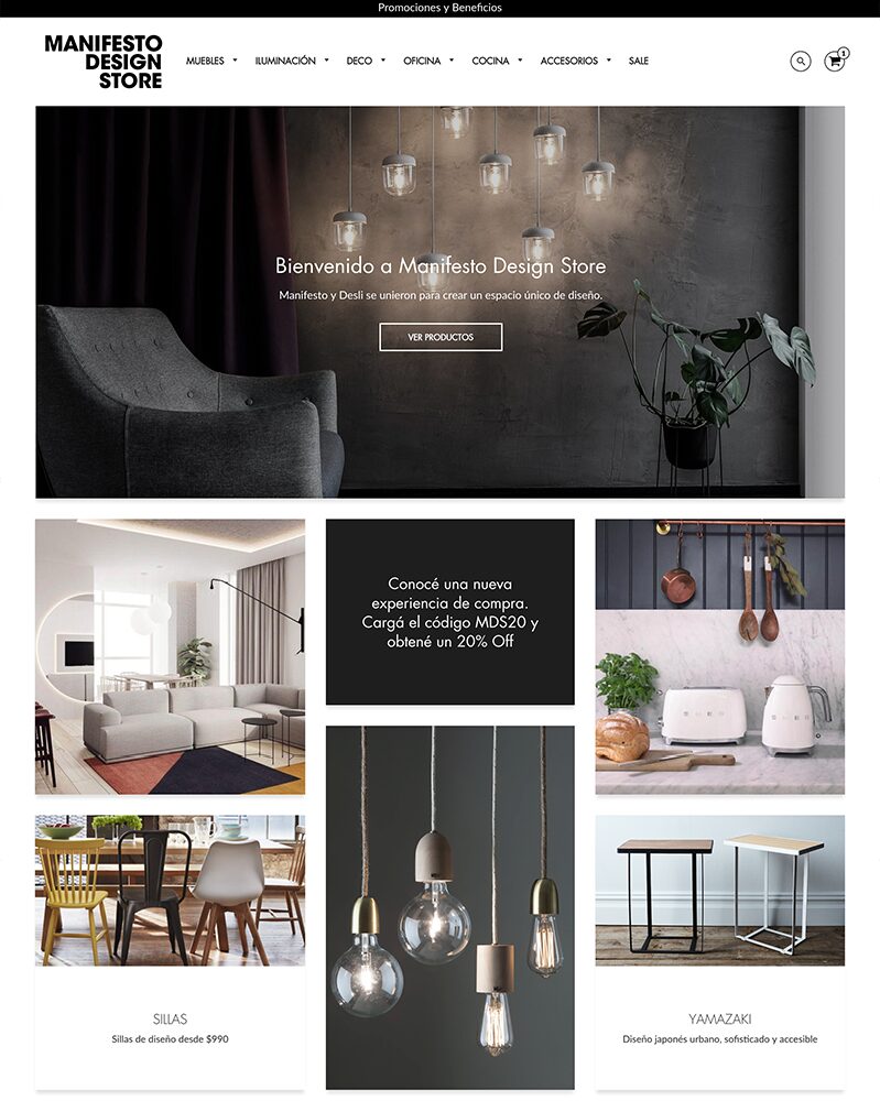
Loft
Ideal for: Budget large-catalog grids
Loft is the budget grid on this list, and it is a clean, straightforward option for stores with large catalogs. Its layout keeps products front and center, and at the lowest price here it is an easy entry point for a new visual store.
You will not find it on as many stores as the pricier options, but for a simple, affordable product grid it does the job.
Loft Highlights:
- Lowest price on this list
- Clean grid built for large catalogs
- Products stay front and center
- Straightforward, easy to set up
Loft Usage Statistics
Loft usage at a glance, from our Shopify store dataset, refreshed daily.
-
Are Shopify grid themes responsive and mobile-friendly?
Yes. The grid themes on this list are responsive, so they adapt to different screen sizes and keep products readable on phones, tablets, and desktops. Since most store traffic is on mobile, a grid that reflows cleanly to one or two columns matters, and each pick here handles that well.
-
Can I integrate social media into Shopify grid themes?
Absolutely, Shopify grid themes support social media integration. Users can easily connect their online store to various social platforms, enhancing visibility and customer engagement.
-
How do Shopify grid themes impact SEO?
Shopify grid themes can positively impact SEO when optimized correctly. The clean and organized layout aids in better content presentation, making it easier for search engines to index and rank the website.
-
What is a Shopify grid theme?
A grid theme arranges your products in evenly sized tiles, usually in rows and columns, so shoppers can scan many items at once. It suits visual, image-first catalogs like fashion, tech, and beauty. Most modern Shopify themes offer grid collection layouts; the ones on this list do it cleanly and stay fast.
-
Which grid theme is best for a large catalog?
Warehouse is the strongest pick for large catalogs, with advanced filtering, live search, and multi-column menus that keep hundreds of products browsable. Broadcast and Capital also handle deep catalogs well. For a budget option at scale, Loft keeps a large grid simple and affordable.
-
Do grid themes slow down a Shopify store?
They can, because a grid loads many product images at once. The fix is a theme with clean code and lazy loading, which every pick here includes. Keep your images compressed and avoid stacking heavy apps, and a grid store can still load quickly on mobile.
Choosing a Shopify Grid Theme
The picks above are ordered by how widely each is used in our data, and that order is a fair starting point: Broadcast, Warehouse, and Motion are proven at scale and each handles a dense catalog cleanly. Broadcast leans editorial, Warehouse is built for very large ranges, and Motion adds movement without slowing the page.
Match the theme to your catalog and budget. If you are watching costs, Loft is the most affordable way onto a clean grid, while Capital and Streamline suit design-led and fashion stores. Booster is the all-in-one option if you want marketing tools bundled with the grid. Whichever you choose, keep an eye on speed, since image-heavy grids live or die on load time.
Want to compare more layouts? Browse our full list of Shopify themes, or see related picks for clothing stores and fast-loading themes.