Snoopermarket Case Study: Shopify Design Lessons From Snoop Dogg’s Store
Last modified: June 28, 2026

| # | Name | Image | |
|---|---|---|---|
| 1 |
|
Booster
|
|
| 2 |
|
Xclusive
|
|
| 3 |
|
Berlin
|
|
| 4 |
|
Boost
|
|
| 5 |
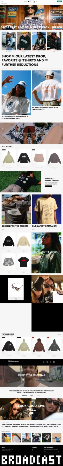
|
Broadcast
|
|
| 6 |
|
Streamline
|
|
| 7 |
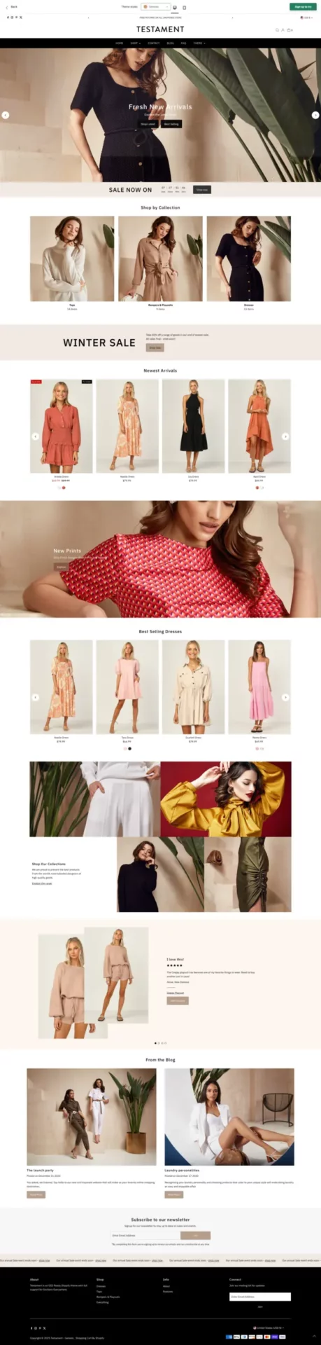
|
Testament
|
|
| 8 |

|
Honey
|
|
| 9 |
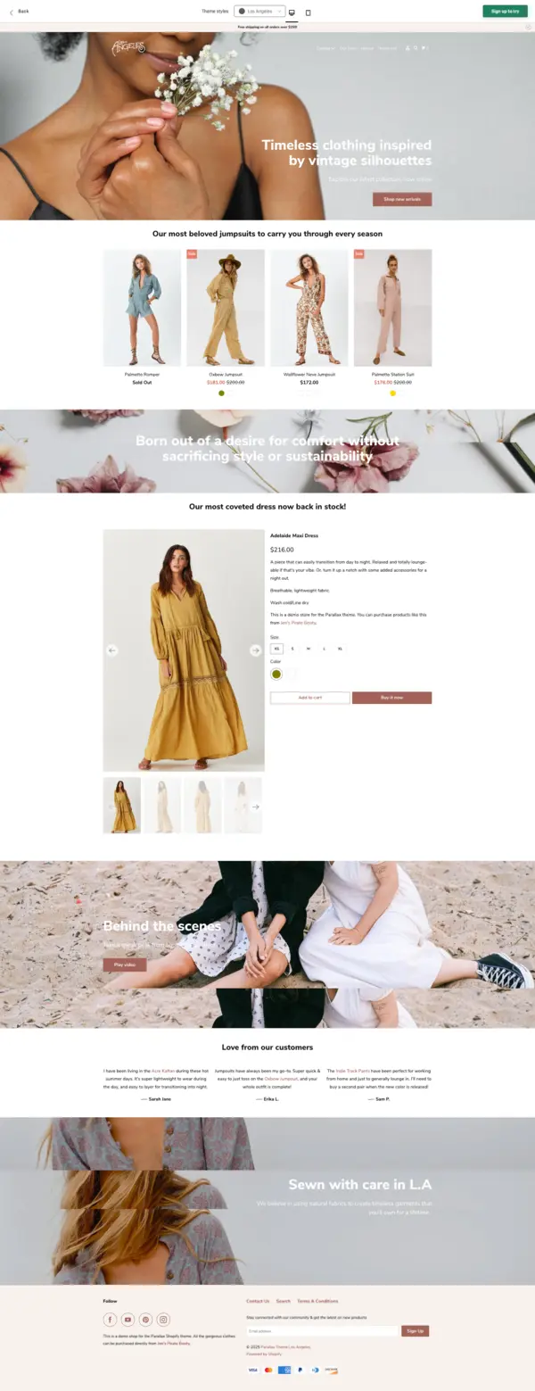
|
Parallax
|
|
|
Show More
|
|||
Our rankings aren't just opinions. They are based on proprietary detection data from 3.5 million+ Shopify stores, aggregated daily since 2017.

-
What Shopify theme does Snoopermarket use?
Snoopermarket runs on a heavily customized Shopify build that appears to combine elements of the Dawn family with bespoke section code. The lack of stock hero patterns and the custom mid-scroll video block both point to a custom theme rather than an off-the-shelf one. For stores wanting a similar feel, the closest off-the-shelf options sit in the streetwear and premium-fashion theme categories.
-
What can a small Shopify store actually learn from Snoopermarket?
The transferable lessons are not the celebrity collaborations or the custom video shoots. They are the choices any store owner can copy for free: pick a stronger typeface, name collections after stories instead of garment types, cut popups, and give the hero one job. These choices cost nothing and move conversion rates more than most paid apps.
-
Is Snoopermarket actually built on Shopify?
Yes. Snoopermarket runs on Shopify, which you can confirm by viewing the page source or running the store through a Shopify theme detector. Like most large branded Shopify stores, it uses a custom theme on top of Shopify’s standard checkout, which is one of the reasons the site loads fast and converts well on mobile.
-
Why does Snoopermarket use so much white space?
White space is doing two jobs at once: it lets the product photography carry the page, and it signals premium positioning. Streetwear and luxury brands both use generous spacing to push the eye toward the product and away from sales copy. For lower-priced stores, white space still works, but the photography has to be strong enough to fill it.
-
How do I find what theme any Shopify store is using?
Paste the store URL into a Shopify theme and app detector. It checks the page source for theme markers and app references, then reports back which theme and apps the store is running. This is one of the fastest ways to reverse-engineer a competitor’s stack before you pick your own theme.

1. First Impressions: Clean, Cool, and Unexpected
The Snoop Dogg clothing website welcomes you with an unexpected twist: minimalism. No autoplay music, no seizure-inducing animations. Just high-contrast design, sharp product images, and an easy scroll.
Why it works: the audience already knows who Snoop is. The site does not have to scream. Instead, it creates visual breathing room, keeping the focus on the products, which is exactly where the money is.
Font Game:
The homepage features Neue Haas Grotesk, a modern revival of Helvetica, which gives the site that fashion-forward, high-end streetwear look. The font reads luxury, but with a West Coast accent.
Headlines are strong, clean, and spaced with confidence. Body text is clean, minimal, and straight to the point. It gives off quiet confidence, as in: “We know you’ll cop. We don’t have to yell.”
2. Smart Category Breakdown
One thing Snoop does better than most Shopify brands: his categories are immediately clear and visually distinctive.
From “Death Row Records” to “The Doggystyle Collection” to “Kids Collection,” every section feels branded, thematic, and instantly recognizable.
The categories do not blend, they pop. Using oversized product grids, full-width banner images, and smart sectioning, shoppers never have to wonder where to click.
Takeaway for store owners: break your store into iconic, brandable collections. Do not just label sections “Hoodies” and “Shirts.” Make each feel like a world, a moment, a mood.
3. Visual Hierarchy: Snoop Knows Scroll Behavior
The Snoop Dogg clothing website is built for momentum.
The homepage is structured like a mixtape, where each section is a different vibe, but all blend together for a smooth ride.
You go from:
- High-contrast product carousels
- Video storytelling blocks (ft. Snoop himself)
- Scroll-triggered lifestyle sections
- Clean white-background “homegoods” and “kidswear” panels
It feels like switching between tracks on a Snoop album, each one serving a purpose, keeping you locked in.
Design tip: use scroll pacing to your advantage. Snoop switches up visuals every two to three sections. You should too. Do not let your homepage become a scroll-fatigue trap.
4. Product Pages That Do Not Play
Now for conversion.
Each product page is a masterclass in balance. You will see:
- Big, bold product photos
- Clean “Add to Cart” CTAs
- Size selectors with no fuss
- Descriptions that are short, readable, and mobile-optimized
- Simple trust-building badges (shipping, returns, etc.)
Most importantly: no pop-ups or distractions. Snoop’s team knows that once the shopper lands on the product, it is time to let the gear shine.
What store owners can copy: cut the fluff. Kill the carousels that go nowhere. Make the “Buy” path frictionless.
5. Video Integration Done Right
Few Shopify stores execute embedded video well. But Snoop Dogg’s clothing website does it with finesse.
The mid-scroll video block shows Snoop styling the gear, walking through his vibe, and building lifestyle value. It is immersive, short, and perfectly placed.
Pro tip: show your product in action, on real people, in real scenarios. People do not just buy clothes. They buy the feeling.
6. Storytelling Without Overdoing It
The “About” block on Snoop’s site is compact and powerful. It gives you just enough of the story to feel connected, without reading like a brand pitch.
“The Death Row Chronicles and Dr. Bombay threads that define street legend Snoop’s lifestyle.”
That one line sets the tone.
Lesson: do not dump your life story on the homepage. Give them the vibe, the heritage, the hook, and let the product do the rest.
7. Merch Meets Lifestyle
This is not just merch. This is merch with taste. Snoop has products across:
- Apparel (graphic tees, tracksuits, sweats)
- Homegoods (vinyls, figurines, framed posters)
- Kidswear (yes, baby onesies with Snoop’s face, iconic)
And it all feels consistent. Cohesive. Built from one vision.
Takeaway: you do not need a million products. But you do need a clear vibe. Stick to a design system. Make every item feel like it belongs in the same closet, or the same playlist.
8. Footer That Works (Yes, Really)
Snoop’s footer is functional without being forgotten. It is dark, clean, and includes:
- Navigation
- Policy links
- Newsletter signup
- Socials
- Language & currency switcher
Here is what makes it stand out: everything is easy to find. There is no chaos. Just structure.
Quick tip: do not let your footer be an afterthought. It is where conversions finalize, trust is built, and SEO juice lives.
9. Mobile Optimization: Built for the Thumb
The Snoop Dogg clothing website is not just desktop-friendly. It thrives on mobile.
Here is what it nails:
- Tap targets are big and easy to hit
- Load times are fast, even with video
- Mobile nav is clean and collapsible
- Product scrolls are swipe-friendly
- No funky resizing or off-screen elements
Reality check: if your store is not flawless on mobile, you are leaking money. Snoop’s site shows how to serve mobile-first shoppers without compromise.
10. Branding That Sells Without Saying “Buy Now”
The biggest flex of all: Snoop’s brand does not have to push product.
Everything about the design (fonts, spacing, colors, layout) feels curated, not commercial. It is built to reflect a lifestyle, not just hawk a hoodie.
Copy this: build brand equity through experience. Let your design feel like your product. If you sell premium, make your site feel expensive. If you sell chillwear, make your store chill to shop.
Final Take: Why Snoop’s Shopify Is a Masterclass
Here is a recap of what makes the Snoop Dogg clothing website one of the best Shopify stores out there:
- It is minimal, but bold.
- It is cool, but conversion-focused.
- It is merch, but premium.
- It is built with clarity, hierarchy, and intent.
Snoop is not just winning on vibes. He is winning on UX, mobile-first design, and smart storytelling. This site proves that when you combine clout with clean design, you do not need to shout to be heard.
What You Can Steal from the Snoopermarket:
- Use fonts with heritage and weight; Neue Haas Grotesk is elite
- Break your homepage into “scrollable chapters”
- Embed videos with purpose, not just for flair
- Build collections around stories, not SKUs
- Design for mobile first, desktop second
- Be bold with category names and visuals
- Treat your site like an experience, not a catalog
Want your Shopify store to hit different? Study the Snoopermarket. Take notes. Then remix the formula into your own digital legacy.
Because if there is one thing we have learned from the Doggfather…
Cool never goes out of style.