3 Best Shopify Old Money Aesthetic Themes 2026
Last modified: June 10, 2026

| # | Image | Name | Adoption | PageSpeed |
|---|---|---|---|---|
| 1 |
|
Palo Alto - Luxe
|
<0.1% | 82/100 |
| 2 |
|
Desert - Luxury
|
<0.1% | 86/100 |
| 3 |
|
Wonder - Couture
|
0.4% | 66/100 |
|
Show More
|
||||
Quick Comparison
| Theme | Best For | Price | Key Feature |
|---|---|---|---|
| Palo Alto - Luxe | Linen, blazers, heritage denim, resort-wear | $350 | Warm-stone palette + lifestyle photography blocks |
| Desert - Luxury | Slow fashion, fragrance, leather goods, boutiques | $350 | Oxblood accents + heirloom-magazine layout |
| Wonder - Couture | Capsule drops, jewelry, watches, free-theme launches | Free | Editorial typography on Shopify’s own free theme |
Data first, opinion second: we track usage across 3.5+ million Shopify stores daily, and have since 2017. The stats tell us what merchants actually use; our editors rank the final picks by quality, pricing, and fit.
How These Themes Compare on Speed
| Theme | PageSpeed (demo) | Real-world CWV | Median LCP | CWV pass |
|---|---|---|---|---|
| Desert | 86/100 | — | — | — |
| Luxe | 82/100 | — | — | — |
| Wonder | 66/100 | — | — | — |
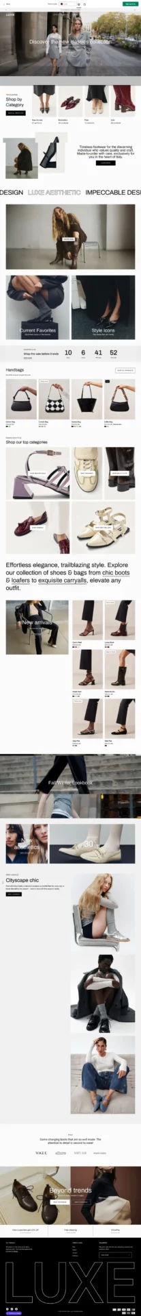
Palo Alto - Luxe
Do not let the name fool you. Palo Alto reads less startup-chic and more Ivy League legacy. Soft neutrals, natural textures, and lifestyle-forward blocks capture old money minimalism without sterility, and the wide-format layout flexes lifestyle photography in a relaxed, expensive way.
Best fit: linen sets, structured blazers, heritage denim, equestrian or country-club apparel, and resort-wear brands that want to feel like they belong in a Ralph Lauren catalog or a Hamptons wardrobe. The default warm-stone palette (cream backgrounds, soft taupe accents) is ready out of the box, with serif headline options that pair naturally with editorial product photography.
Palo Alto Theme Highlights
- Warm-stone color palette with subtle quiet-luxury energy
- “Shop the look” functionality styled like a magazine spread
- Roomy layout that spotlights lifestyle photography over product walls
- Great for storytelling through collection banners and feature grids
- Pairs naturally with serif headline fonts like Cormorant or Garamond
Luxe Page Speed: Live Data
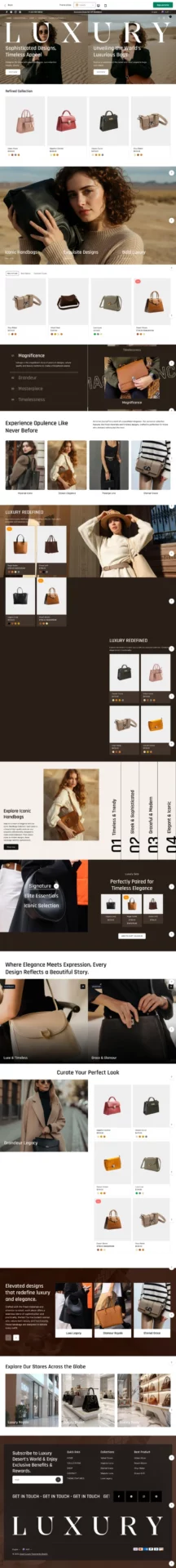
Desert - Luxury
If quiet luxury had a homepage, it would look exactly like the Desert theme. Velvety burgundy accents, editorial image slots, and whisper-soft typeface choices read like an heirloom fashion magazine, not an ecommerce template.
Best fit: boutiques with a clear brand story, slow-fashion labels, fragrance houses, fine leather goods, and tailored garment lines. Curated lookbooks, minimalist product grids, and a layout that gently guides the eye give shoppers the feeling of a warm, restrained world the moment they land. The serif typography pairing and oxblood accent color hit the old money palette without any customization.
Desert Theme Highlights
- Deep serif typography and warm-rich color tones that feel heritage-inspired
- Immersive homepage with visual storytelling sections
- Editorial-style banners and image-text layouts
- Ideal for slow fashion, fragrance, leather goods, and luxury lifestyle products
- Burgundy and oxblood accent palette built in
Desert Page Speed: Live Data
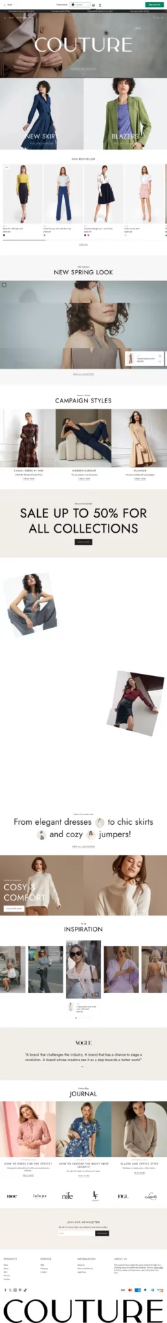
Wonder - Couture
Wonder is the most freshly-polished pearls of the bunch. A pristine, effortless layout that still feels deeply aspirational, with crisp off-white backgrounds and high-contrast photography slots that play in high-society visual language without leaning corporate.
Best fit: capsule collections, exclusive drops, modern heritage brands, and watch or jewelry stores that want generational-taste styling on a free theme. Product grid spacing is immaculate, the default fonts read like a Parisian boutique’s calling card, and the flow is intuitive but couture-worthy. Since Wonder is Shopify’s own free theme, it is the strongest old money pick for stores launching on a budget or testing the aesthetic before committing to a paid theme.
Wonder Theme Highlights
- Free Shopify-built theme with classic design and modern spacing
- Product grids and banners with high-fashion layout cues
- Typography that leans editorial, not ecommerce
- Great for capsule collections and exclusive drops
- Strong defaults for stores starting on a free theme before upgrading
Wonder Page Speed: Live Data
-
What makes a Shopify theme feel ‘old money’ versus just ‘luxury’?
The difference is restraint. Generic luxury themes lean on glossy product photography, dark backgrounds, and bold serif headlines that scream “premium.” Old money themes do the opposite - muted neutrals (cream, taupe, charcoal), generous white space, transitional or old-style serif typography, and editorial layouts that feel like a print magazine. The aesthetic whispers heritage instead of announcing luxury, and the theme has to support that with subtle typography options, refined color systems, and editorial-style section blocks rather than tile-grid product walls.
-
Can I get the old money look on a free Shopify theme like Dawn?
Partially. Dawn is flexible enough to push toward a quieter, more editorial feel through customization - switch to a serif headline font (Cormorant or Playfair via Google Fonts), use a cream or ivory background with charcoal text, increase margin padding, and replace product-card grids with collection-list layouts. The trade-off is that Dawn’s section blocks weren’t designed for editorial pacing, so layouts will feel slightly more ecommerce-templated than purpose-built old money themes. For a small catalog launch, Dawn customized this way works. For a brand committing fully to the aesthetic, a paid theme designed around editorial layouts saves weeks of customization.
-
What colors work best for an old money Shopify store?
Stay in the warm-neutral and deep-jewel range. Strong palettes: cream + charcoal, ivory + warm taupe, oatmeal + oxblood, off-white + deep navy. Avoid pure-white-plus-neon (reads tech), all-black-plus-gold (reads nightclub), and beige-plus-pink (reads boho). The test: hold up a swatch of the palette next to a vintage Ralph Lauren ad or a Hermès window display. If it feels in the same family, you’re on the right track.
-
How do I show product photography on an old money theme without it looking flat?
Three rules. First, shoot on natural light or soft diffused studio light - never harsh on-camera flash. Second, use environmental context where possible (a leather chair, a marble surface, a bookshelf) instead of pure white seamless backgrounds for at least 30-40% of your images. Third, keep edits restrained - film-emulation presets like Kodak Portra 400 or muted earth tones in Lightroom feel correct; saturated, high-contrast Instagram-style edits don’t. The strongest old money product galleries mix product-on-context shots with one or two clean catalog shots - exactly the photography mix the best heritage fashion houses use.
-
What are the best Shopify fonts for a quiet luxury old money store?
Stay in the serif and transitional family. Strong pairings include Cormorant Garamond for headlines with Inter or Source Sans for fine print, Playfair Display for editorial headers with a refined sans like Mulish, or a single all-serif system using Libre Caslon Text. Avoid heavy geometric sans-serifs (Poppins, Montserrat, Inter at large display sizes), display script fonts, and anything that ships as the default on a tech-startup template. The test: hold a screenshot next to a page from a vintage Ralph Lauren catalog. If the headline weight and letter-spacing read in the same family, the pairing works.
-
How much should an old money Shopify theme cost, and is paid worth it over free?
Paid old money themes from the Shopify Theme Store run roughly $280 to $400 (one-time, not subscription), and the best free option is Wonder. Paid themes earn their price when you need shipped-in editorial layouts, advanced typography controls, oxblood or warm-neutral palettes built in, and section blocks designed for lookbook-style storytelling. Free themes like Wonder work for launches under 30 products or for testing the aesthetic before committing, but heavy customization on a free theme often costs more in developer hours than the price of a purpose-built paid theme.
What to Look For When Buying an Old Money Shopify Theme
Before you commit to a theme, run it through this short buying checklist. The old money look fails or holds based on these details, not on overall theme polish.
- Default headline font is serif or transitional. If the demo store leads with a heavy geometric sans-serif, the theme will fight you the whole way.
- Demo palette uses warm neutrals. Cream, ivory, oatmeal, taupe, oxblood, deep navy, warm brown. If the demo is pure-white plus a neon accent, the brand identity is wrong.
- Generous default whitespace. Old money themes give product imagery room to breathe. Cramped tile grids read fast-fashion.
- Slow-luxury imagery in the demo. Editorial lifestyle shots, environmental product photography, no neon overlays or burst graphics.
- Two-face typography max. Serif primary plus a refined sans for fine print, or a single serif system. Three or more fonts breaks the aesthetic.
- No urgency UI built in. Countdown timers, “X people viewing,” and visitor-count widgets are anti-old-money. The best themes simply do not ship with those modules.
Conclusion: The Best Old Money Shopify Theme Is the One That Whispers
The old money aesthetic is about the experience you craft, not what you sell. Palo Alto leans Ivy League and lifestyle-forward, Desert reads heirloom magazine with oxblood warmth, and Wonder gives you genuine quiet luxury on a free theme.
Pick the one whose default palette, typography, and editorial pacing match the brand you actually want to build, then commit to the same restraint in your photography and copy. Browse more Shopify clothing themes if you want to compare across the wider fashion category.