Website Design in 2025: 10 Things That Are Totally Out of Style (And What to Do Instead)
Last modified: December 30, 2025
Trends fade fast-especially in web design. What looked sleek two years ago now screams “theme.” And if your site still feels like it’s stuck in 2018, you’re not just losing attention-you’re leaking conversions.
Today’s web users want sites that feel smart, soft, fast, and intentional. The bar is higher. The scroll is faster. And “modern” isn’t enough-it needs to feel alive.
Let’s break down the design elements that are officially out in 2025-and what to swap in instead to keep your Shopify site, portfolio, or digital brand fresh and high-converting.
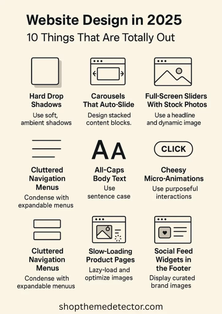
1. Hard Drop Shadows
Why it’s out:
Harsh, dramatic shadows feel clunky and artificial. They scream outdated skeuomorphism and ruin modern minimal layouts.
Do this instead:
Use soft, ambient shadows with high blur and low opacity. Or better: lean into layering and depth through subtle elevation and color gradients.
2. Carousels That Auto-Slide
Why it’s out:
People scroll faster than your carousel rotates. Plus, it creates a control issue. It’s like your site is grabbing the mouse from their hand.
Do this instead:
Design stacked, scrollable content blocks. Give users full control-and make each block scroll-worthy.
3. Popup Overload
Why it’s out:
When 3 popups attack the moment your homepage loads-email signup, cookie policy, and a 10% discount-you’re not converting. You’re repelling.
Do this instead:
Use intent-based modals. Trigger popups only when a user scrolls halfway, shows exit intent, or clicks on something curiosity-driven. Keep it vibe-aware.
4. Full-Screen Sliders With Stock Photos
Why it’s out:
Overused. Generic. Looks like a theme demo, not a real brand. Stocky hero sliders rarely say anything real.
Do this instead:
Swap it for a statement visual + bold headline combo. Use motion, texture, or product-in-action footage instead of canned lifestyle fluff. Or maybe you want to ditch your slider altogether.
5. Generic Call-to-Action Buttons
Why it’s out:
“Click Here.” “Shop Now.” Snoozefest. You’ve got 0.5 seconds to make someone care.
Do this instead:
Use contextual CTA copy. Try:
- “Steal the Look”
- “Let’s Get Ritualistic”
- “Build Your Set”
Match the tone of your brand-and talk like a human.
And ugly bold buttons? The chef’s kiss.
6. Cluttered Navigation Menus
Why it’s out:
Too many nav links = decision fatigue. Mobile-first design makes multi-level menus a nightmare.
Do this instead:
Use condensed nav with expandable menus or mega menus for large inventories. Prioritize your top 4-5 flows, and move the rest to footers or secondary links.
7. All-Caps Body Text
Why it’s out:
It’s hard to read. Aggressive. Feels like shouting in Helvetica.
Do this instead:
Use sentence case for body text and save all-caps for microcopy, button labels, or section headers (and only in moderation). Pair with soft kerning and chill line height.
8. Slow-Loading Product Pages
Why it’s out:
Nobody’s waiting more than 3 seconds for your moisturizer photos to load. High-res is not an excuse for bad compression.
Do this instead:
Lazy-load images. Use WebP or AVIF formats. Optimize your stack. And preload assets that actually sell (first image, first variant, top CTA).
9. Cheesy Micro-Animations
Why it’s out:
Wiggling buttons, spinning icons, pointless hover effects-they’re more annoying than delightful now. The novelty’s worn off.
Do this instead:
Use micro-interactions with purpose: a button press that gives feedback, a smooth fade on scroll, or hover states that offer info, not fluff.
10. Social Feed Widgets in the Footer
Why it’s out:
Nobody’s checking your Instagram grid from your footer. It clutters your layout and slows your load time.
Do this instead:
Curate 1-3 key UGC or brand images and design them into your layout with purpose. Or just link out cleanly with a branded icon and call it a day.
Final Thoughts: Trends Change. Trust Doesn’t.
Your site shouldn’t just follow trends-it should understand them. Know when to adapt, when to simplify, and when to flex. The design decisions you make are silent signals to your audience: We’re current. We care. We’re not using a template from 2016.
So ask yourself-does your site feel like your brand today? Or does it still have the energy of “we’ll fix this later”?
If it’s the latter-I got you. Let’s turn that “meh” layout into a scroll-stopper. Quiet luxury, soft brutalism, Gen Z core, cozy chaos-we can build it. Read more about best design practices on Shopify here. Trust the trends, listen to the wind and you’ll be on your way to a beautiful custom Shopify store.


