Creating an Attractive Shopify Store: 5 Fixes That Actually Work
Last modified: May 26, 2026

| # | Name | Image | |
|---|---|---|---|
| 1 |
|
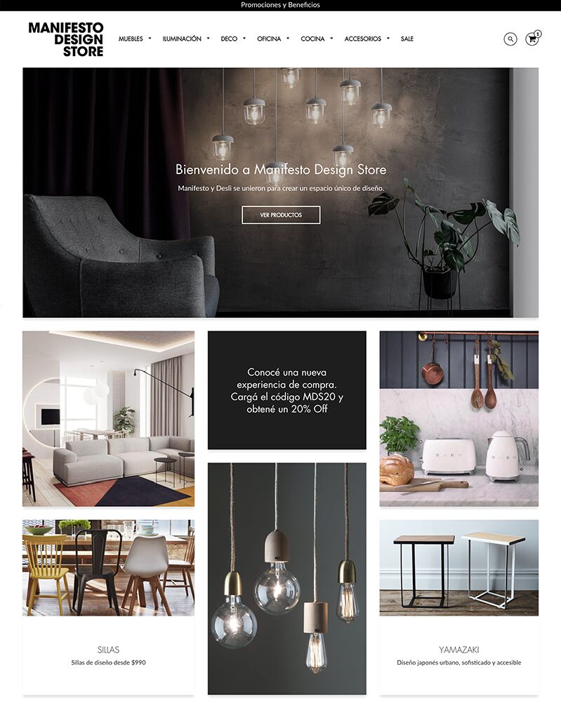
Boost
|
|
| 2 |
|
Blockshop
|
|
| 3 |
|
Galleria
|
|
| 4 |
|
Beyond
|
|
| 5 |
|
Loft
|
|
| 6 |
|
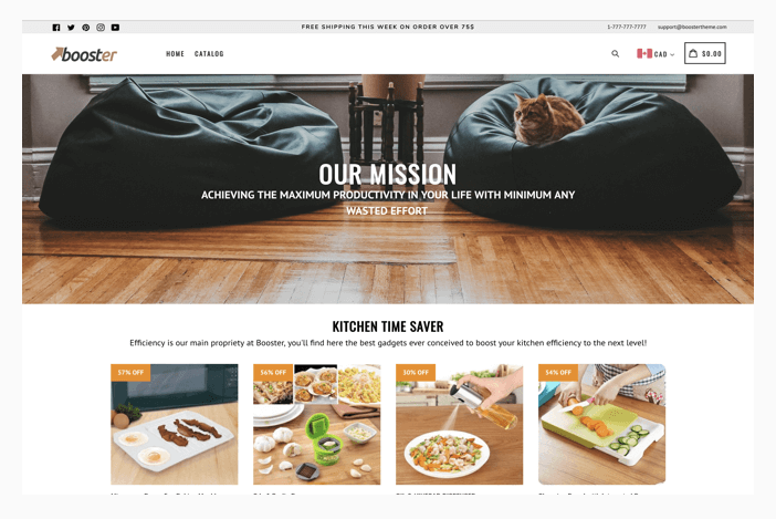
Booster
|
|
|
Show More
|
|||
-
How can I create effective product descriptions for my Shopify store?
Write clear, concise, and compelling product descriptions that highlight the benefits and features of your products. Use bullet points for easy reading, and include keywords for SEO. Remember, your goal is to solve the customer’s problem or fulfill their need.
-
How do I choose the right color scheme for my Shopify store?
Selecting a color scheme that complements your brand and products is crucial. Consider your target audience’s preferences and the psychological impact of colors. For example, blue can evoke trust, while yellow may inspire optimism.
-
What are the best practices for Shopify SEO to improve my store’s visibility?
Focus on keyword research to understand what your potential customers are searching for. Use these keywords in your product titles, descriptions, and meta tags. Additionally, ensure your website’s loading speed is optimized and build quality backlinks.
-
What’s the single most important thing to fix on a Shopify store that doesn’t look professional?
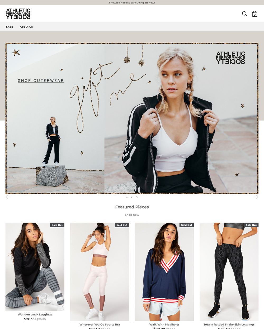
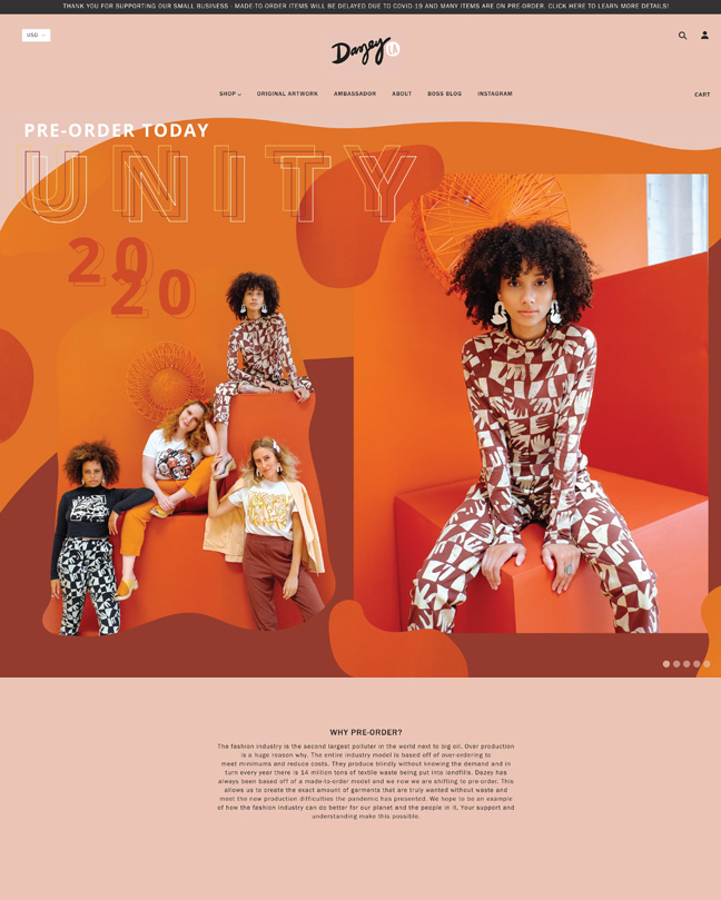
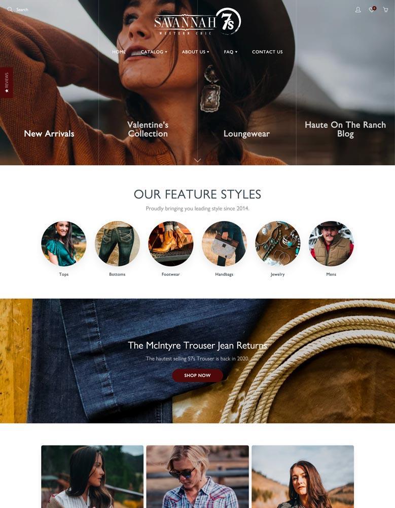
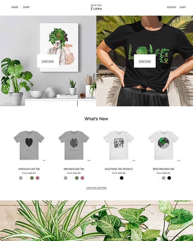
Product photography is almost always the highest-leverage fix. Customers literally cannot judge your products through bad photos - inconsistent lighting, mixed backgrounds, low resolution, photos clearly taken on a phone with no editing. A weekend with proper lighting (a window or a $100 softbox kit), a $30 white seamless paper roll, and consistent composition across all products transforms a store more than any theme change. Theme is the second-highest-leverage fix when you’re using a generic theme for a category-specific brand (streetwear on a generic clothing theme, luxury on a discount-feel template).
-
How much does it cost to make a Shopify store look professional?
For most stores, $50-500 in software and a weekend of work. Theme: $0-360 (Shopify’s free Dawn theme works for many categories). Photography: $0-500 (DIY with a phone or hire a one-day shoot). Email at your domain: $6/year through Google Workspace. Apps for reviews and basic UX: $0-50/month. Stores that hire designers spend $2,000-10,000 for custom theme implementation, which is the right call for established brands with revenue justifying it. For stores under $30K/year, a category-specific premium theme + DIY photography + the trust-signal checklist gets 80-90% of the way there for under $500 total.
-
Should I hire a designer or use a Shopify theme?
For most stores, use a theme. Premium themes from the Shopify Theme Store ($200-400 one-time) are professionally designed and will out-perform 90% of designer-built custom Shopify stores at small scale. Where designers earn their fee: stores doing $500K+/year that need specific custom flows, B2B integrations, or brand identity that doesn’t exist in any template. Below $100K/year, a premium theme + good photography + solid copy outperforms a hired designer at a fraction of the cost. The exception: if you’ve already chosen a premium theme and need someone to customize specific Liquid logic for your business rules, that’s developer work (typically $500-2,000), not full-design work.
Conclusion: Three Fixes That Move the Needle
Most Shopify stores that look unprofessional fail on the same three things - wrong theme for the category, weak product photography, and unclear copy. Fix those three and the trust signals (real About page, visible reviews, transparent policies, professional email), and you’ve covered 90% of what makes a store look real to customers. None of it requires a designer or a custom theme. A category-specific premium theme, a weekend of photography, and an afternoon writing better copy gets most stores from “amateur” to “professional” for under $500 total.