5 Shopify Old Money Aesthetic Themes for 2026
Last modified: September 24, 2026
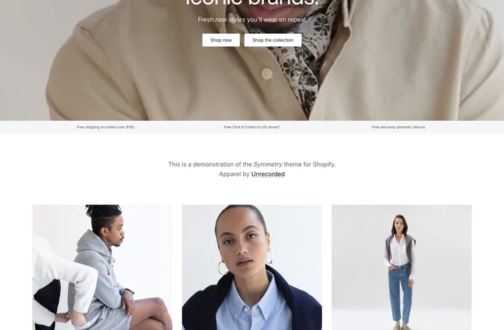
| # | Image | Name | Price | Reception | Adoption | CWV pass rate |
|---|---|---|---|---|---|---|
| 1 |

|
Prestige
|
$400 | (869) | 4.4% | 78.8% |
| 2 |
|
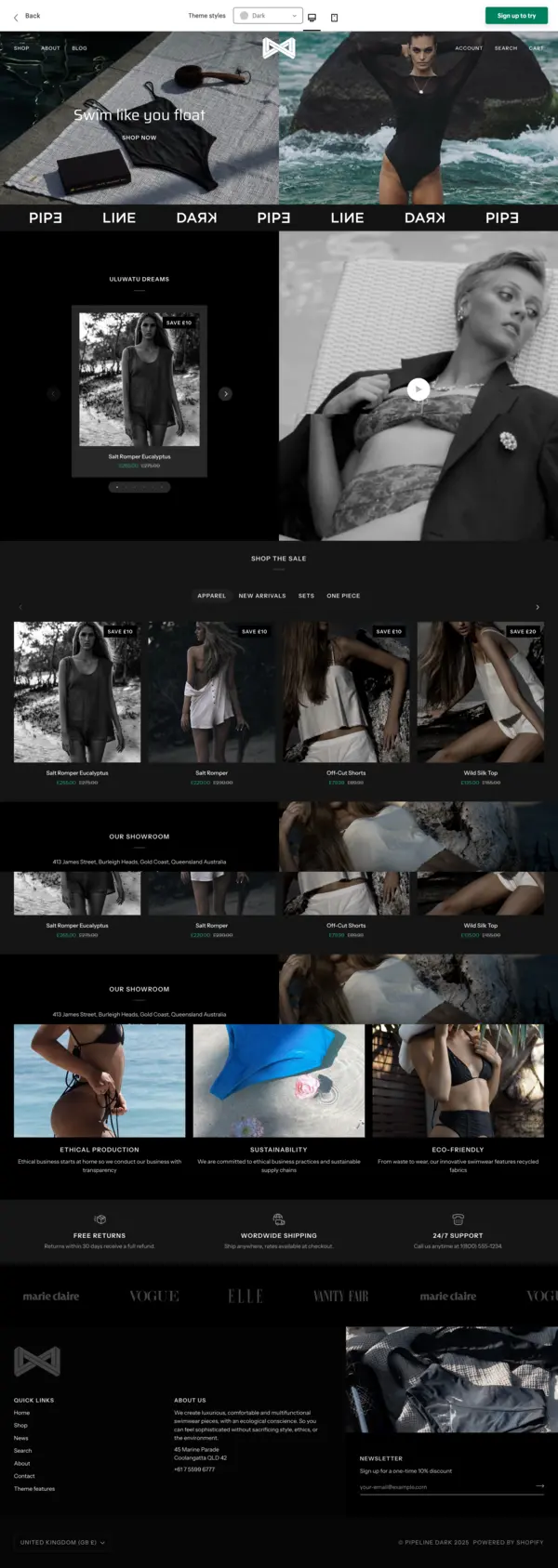
Pipeline
|
$360 | (209) | 0.7% | 69.6% |
| 3 |

|
Wonder
|
$390 | (146) | 0.5% | 63.5% |
| 4 |

|
Desert
|
$100 | (21) | <0.1% | — |
| 5 |
|
Heritage
|
Free | (13) | 0.1% | 64.7% |
|
Show More
|
||||||
Data first, opinion second: we track usage across 3.5+ million Shopify stores daily, and have since 2017. The stats tell us what merchants actually use; our editors rank the final picks by quality, pricing, and fit.
How These Themes Compare on Speed
| Theme | CWV pass rate | Few apps | Median LCP |
|---|---|---|---|
| Prestige | 78.8% | 85.7% | 1.6s |
| Pipeline | 69.6% | 79.2% | 1.7s |
| Heritage | 64.7% | 79.2% | 1.7s |
| Wonder | 63.5% | 63.9% | 1.8s |
Prestige
Ideal for: Heritage and luxury labels
Prestige is the natural lead for an old-money aesthetic: understated, refined and built by Maestrooo for high-end brands. Its restrained layout, generous whitespace and large, quiet imagery give the expensive, effortless feel the look depends on, where the store should suggest quality rather than announce it.
The merchandising and search are strong without being loud, so a considered catalogue stays easy to browse while keeping the calm, gallery-like pace these brands want. Typography and spacing are tuned for a premium read, which matters when the whole aesthetic rests on looking timeless rather than trendy.
It is built for heritage and luxury labels where the store should whisper, not shout. It is the most proven pick here and a safe, long-term foundation for a brand built to last.
Prestige Highlights:
- Refined, high-end aesthetic with generous whitespace
- Most-reviewed pick here
- Strong, quiet merchandising and search
- Premium typography and spacing
- Premium paid theme by Maestrooo
Here is how it shows up in our store data:
Prestige Page Speed: Live Data
Pipeline
Ideal for: Quiet-luxury wardrobes and heritage staples
Pipeline suits the quiet-luxury look better than most. Its minimal, dark-leaning layouts carry an understated polish, letting tailoring and natural fabrics speak without loud graphics or hard-sell banners.
The restraint is the point here. A heritage-minded label reads as expensive when the storefront stays spare, and Pipeline holds that line from the first scroll to the product page.
Pipeline Highlights:
- Minimal, understated layouts
- Room for tailoring and fabric detail
- Restrained, premium tone
- Premium paid theme by Groupthought
Here is how it shows up in our store data:
See our full Pipeline review for the breakdown.
Pipeline Page Speed: Live Data
Wonder
Ideal for: Clean, refined premium stores
Wonder is an award-winning, conversion-focused theme with clean, professional layouts, a strong match for a polished old-money storefront that wants to feel crisp and current rather than dated. It is among the more highly rated themes on the store and is well supported.
Where Prestige leans classic, Wonder pairs the refined look with modern conversion tooling, so the store stays elegant while quietly doing the work of selling. Its refined presets give a tasteful starting point, and the merchandising and CRO features help a premium brand turn browsers into buyers without cluttering the design.
It suits brands that want a crisp, refined store with modern conversion tooling underneath the classic look. It suits an old-money label that values a clean, contemporary finish as much as heritage.
Wonder Highlights:
- Clean, award-winning design
- CRO and merchandising tools
- Five refined presets
- $390
Here is how it shows up in our store data:
Wonder Page Speed: Live Data
Desert
Ideal for: Affordable luxury aesthetic
Desert is a budget-friendly theme designed for a luxurious feel, with presets named Luxury, Royale and Imperial that lean directly into the old-money look. It is by far the cheapest way onto this list, and it does not look it.
For a newer brand, that low entry price frees budget for the things that actually sell the aesthetic: photography, styling and stock. The theme still ships with merchandising and conversion tools, so a value setup does not mean a bare-bones store, and the luxury presets give a refined starting point out of the box.
It fits newer brands chasing a high-end aesthetic without a high-end theme budget. Its review base is smaller, so it is less proven than the others, but for a launch or a rebrand on a budget it delivers the quiet-luxury feel affordably.
Desert Highlights:
- Luxury-styled presets (Luxury, Royale, Imperial)
- Merchandising and conversion tools
- Lowest price on this list
- $100, by its developer
Here is how it shows up in our store data:
Heritage
Ideal for: Free editorial base for a heritage-minded brand
Heritage is Shopify’s own free editorial theme, and it earns a spot in this list as the budget alternative to the paid picks above. It leans into the same restraint the aesthetic depends on: long hero sections, unhurried spacing, and space around the product rather than the merchandising density of a growth-focused theme. For a founder-led label with strong photography and a small SKU count, it can hold the look without a theme purchase.
Where it falls short of Prestige and Pipeline is depth. Editorial features you might want (elegant swatches, refined product grids, layered navigation) are lighter here or need an app. But if you are launching or bootstrapping and the storytelling is the whole pitch, Heritage gives you the aesthetic floor for free.
Heritage Highlights:
- Free, from Shopify’s own theme team
- Editorial layout that suits restrained, understated brands
- Same admin and update cadence as Dawn and Sense
- Live speed and adoption data on the Heritage stats page
Heritage Page Speed: Live Data
-
What makes a Shopify theme feel ‘old money’ versus just ‘luxury’?
The difference is restraint. Generic luxury themes lean on glossy product photography, dark backgrounds, and bold serif headlines that scream “premium.” Old money themes do the opposite: muted neutrals (cream, taupe, charcoal), generous white space, transitional or old-style serif typography, and editorial layouts that feel like a print magazine. The aesthetic whispers heritage instead of announcing luxury, and the theme has to support that with subtle typography options, refined color systems, and editorial-style section blocks rather than tile-grid product walls.
-
Can I get the old money look on a free Shopify theme like Dawn?
Partially. Dawn is flexible enough to push toward a quieter, more editorial feel through customization, switch to a serif headline font (Cormorant or Playfair via Google Fonts), use a cream or ivory background with charcoal text, increase margin padding, and replace product-card grids with collection-list layouts. The trade-off is that Dawn’s section blocks weren’t designed for editorial pacing, so layouts will feel slightly more ecommerce-templated than purpose-built old money themes. For a small catalog launch, Dawn customized this way works. For a brand committing fully to the aesthetic, a paid theme designed around editorial layouts saves weeks of customization.
-
What colors work best for an old money Shopify store?
Stay in the warm-neutral and deep-jewel range. Strong palettes: cream + charcoal, ivory + warm taupe, oatmeal + oxblood, off-white + deep navy. Avoid pure-white-plus-neon (reads tech), all-black-plus-gold (reads nightclub), and beige-plus-pink (reads boho). The test: hold up a swatch of the palette next to a vintage Ralph Lauren ad or a Hermès window display. If it feels in the same family, you’re on the right track.
-
How do I show product photography on an old money theme without it looking flat?
Three rules. First, shoot on natural light or soft diffused studio light, never harsh on-camera flash. Second, use environmental context where possible (a leather chair, a marble surface, a bookshelf) instead of pure white seamless backgrounds for at least 30-40% of your images. Third, keep edits restrained, film-emulation presets like Kodak Portra 400 or muted earth tones in Lightroom feel correct; saturated, high-contrast Instagram-style edits don’t. The strongest old money product galleries mix product-on-context shots with one or two clean catalog shots, exactly the photography mix the best heritage fashion houses use.
-
What are the best Shopify fonts for a quiet luxury old money store?
Stay in the serif and transitional family. Strong pairings include Cormorant Garamond for headlines with Inter or Source Sans for fine print, Playfair Display for editorial headers with a refined sans like Mulish, or a single all-serif system using Libre Caslon Text. Avoid heavy geometric sans-serifs (Poppins, Montserrat, Inter at large display sizes), display script fonts, and anything that ships as the default on a tech-startup template. The test: hold a screenshot next to a page from a vintage Ralph Lauren catalog. If the headline weight and letter-spacing read in the same family, the pairing works.
-
How much should an old money Shopify theme cost, and is paid worth it over free?
Paid old money themes from the Shopify Theme Store run roughly $280 to $400 (one-time, not subscription), and the best free option is Wonder. Paid themes earn their price when you need shipped-in editorial layouts, advanced typography controls, oxblood or warm-neutral palettes built in, and section blocks designed for lookbook-style storytelling. Free themes like Wonder work for launches under 30 products or for testing the aesthetic before committing, but heavy customization on a free theme often costs more in developer hours than the price of a purpose-built paid theme.
Choosing your old-money theme
Prestige leads for heritage and luxury labels, Palo Alto suits understated lifestyle brands, Wonder is the clean, refined premium option, and Desert is the affordable way to reach the aesthetic on a budget. Match the theme to your stage and how quietly you want the store to speak, and any of these will serve an old-money brand well.