7 Mobile Shopify Themes
Last modified: October 11, 2026

| # | Image | Name | Price | Reception | Adoption | CWV pass rate |
|---|---|---|---|---|---|---|
| 1 |
|
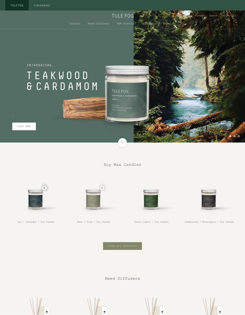
Prestige
|
$400 | (869) | 4.4% | 78.8% |
| 2 |

|
Symmetry
|
$420 | (391) | 1.4% | 81.1% |
| 3 |
|
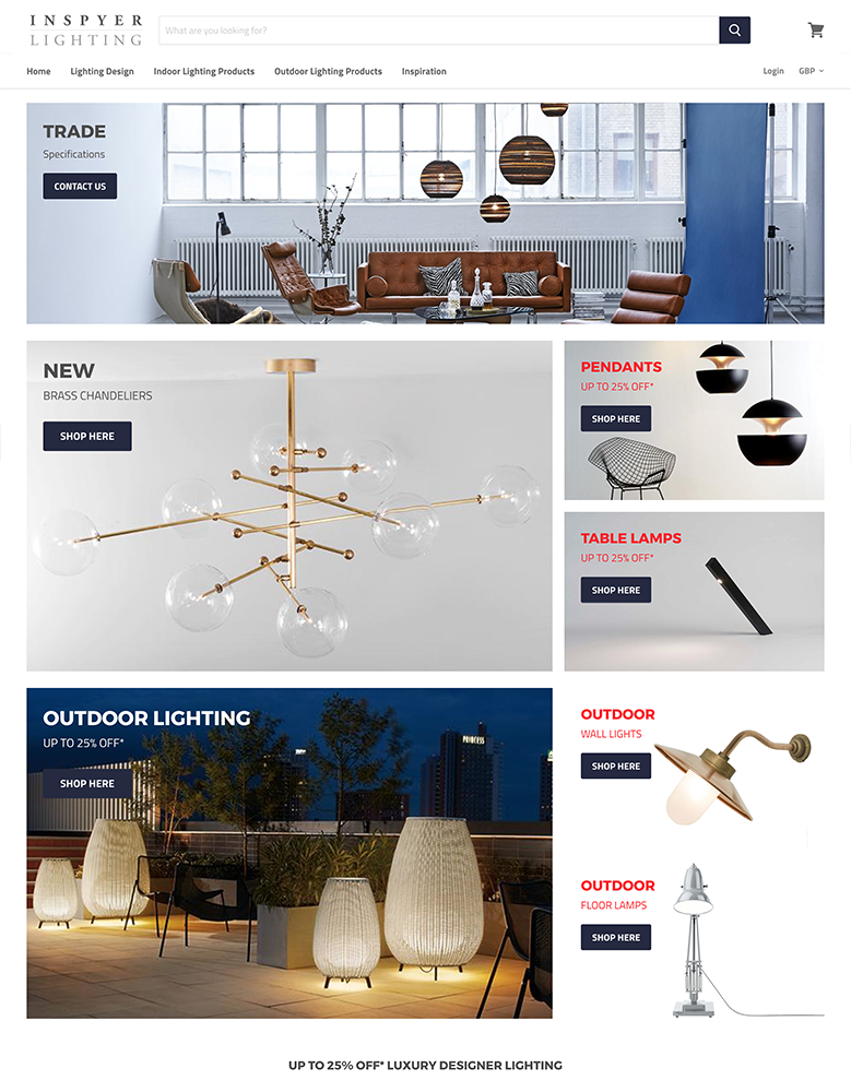
Empire
|
$360 | (481) | 0.6% | 65.5% |
| 4 |
|
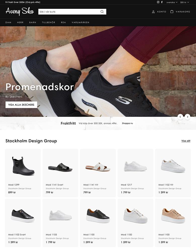
Expanse
|
$420 | (339) | 0.4% | 67.3% |
| 5 |
|
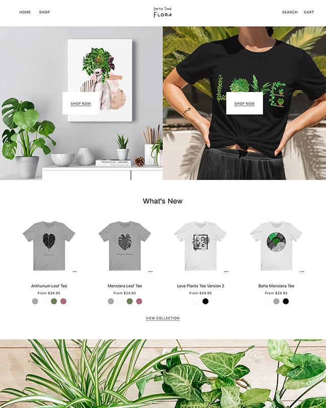
Beyond
|
$420 | (75) | 0.1% | 79.6% |
| 6 |
|
Loft
|
$180 | (175) | <0.1% | — |
| 7 |
|
Booster
|
$299 | 0.2% | 45.4% | |
|
Show More
|
||||||
Data first, opinion second: we track usage across 3.5+ million Shopify stores daily, and have since 2017. The stats tell us what merchants actually use; our editors rank the final picks by quality, pricing, and fit.
How These Themes Compare on Speed
| Theme | CWV pass rate | Few apps | Median LCP |
|---|---|---|---|
| Symmetry | 81.1% | 88.1% | 1.5s |
| Beyond | 79.6% | 82.6% | 1.5s |
| Prestige | 78.8% | 85.8% | 1.6s |
| Expanse | 67.3% | 79.4% | 2s |
| Empire | 65.5% | 78.1% | 1.8s |
| Booster | 45.4% | 50% | 2.1s |
Prestige
Ideal for: Editorial, luxury brands
Prestige from Maestrooo earns its place because editorial themes are the ones most likely to fall apart on a phone, and Prestige does not. Its large imagery and refined typography reflow cleanly to a small screen instead of getting cropped or cramped, so the luxury feel that sells high-end products survives the shrink to mobile.
On the practical side, it keeps a sticky add-to-cart within thumb reach, loads quickly despite the heavy visuals, and its collapsible navigation keeps a deep catalog tidy on a narrow screen. It is also the most-used premium theme in our dataset, so this is a well-tested, well-supported way to run a mobile-first luxury store.
Prestige for Mobile, Highlights:
- Editorial design that reflows cleanly to a phone, not cropped or cramped.
- Sticky add-to-cart and collapsible nav for one-handed browsing.
- Loads quickly despite large, high-resolution imagery.
- The most-used premium theme in our dataset, so well-tested on mobile.
Prestige Usage Statistics
Prestige usage at a glance, from our Shopify store dataset, refreshed daily.
Prestige Page Speed: Live Data
Symmetry
Ideal for: Large, filter-heavy catalogs
Symmetry from Clean Canvas is on this list because the hardest thing to do well on mobile is let someone browse a big catalog, and filtering is how you solve it. Its filters and swatch pickers are built to work with a thumb, so a shopper can narrow hundreds of products by size or color without a desktop-style sidebar getting in the way.
It also tests faster on Google PageSpeed than most themes we measure, which matters more on a phone than anywhere else, and its drag-and-drop sections keep the mobile homepage clean at any catalog size. For the full picture on how it performs and who runs it, see our Symmetry review.
Symmetry for Mobile, Highlights:
- Thumb-friendly filters and swatches that tame a big catalog on mobile.
- Tests faster on Google PageSpeed than most themes we measure.
- Drag-and-drop sections keep the mobile homepage clean at any size.
- Best for large stores that need discovery to work on a phone.
Symmetry Usage Statistics
Symmetry usage at a glance, from our Shopify store dataset, refreshed daily.
Symmetry Page Speed: Live Data
Empire
Ideal for: Big, high-volume catalogs
Empire from Pixel Union makes the cut for the same reason big brands use it: it keeps a very large catalog from becoming a maze on a small screen. Its sticky header and advanced filtering mean a shopper always has navigation and search within reach, even ten scrolls deep into a collection.
Shoppable images and strong cross-sell tools carry over to mobile too, so the theme keeps working to lift the order once someone is browsing on their phone. It leans toward established, high-volume stores rather than a first shop, but for that job it is a proven mobile performer.
Empire for Mobile, Highlights:
- Sticky header keeps nav and search in reach deep in a collection.
- Advanced filtering built for very large catalogs on mobile.
- Shoppable images and cross-sell that work on a phone.
- Best for established, high-volume stores.
Empire Usage Statistics
Empire usage at a glance, from our Shopify store dataset, refreshed daily.
Empire Page Speed: Live Data
Expanse
Ideal for: Large inventories
Expanse from Archetype Themes is here because it treats mobile checkout as seriously as mobile browsing. Its multi-category sidebar filter collapses into a mobile-friendly panel, so even a massive catalog stays sortable on a phone, and its slide-out cart and sticky header cut the number of taps between finding a product and paying for it.
Enhanced search and mega menus round out a navigation set built for scale, and its strong promo tools translate cleanly to a small screen. For a high-volume store that runs frequent offers, it is one of the more complete mobile experiences on this list.
Expanse for Mobile, Highlights:
- Multi-category filter that collapses into a mobile-friendly panel.
- Slide-out cart and sticky header cut taps to checkout.
- Enhanced search and mega menus built for large catalogs.
- Strong promo tools that display cleanly on a phone.
Expanse Usage Statistics
Expanse usage at a glance, from our Shopify store dataset, refreshed daily.
Expanse Page Speed: Live Data
Beyond
Ideal for: Editorial jewelry and beauty
Beyond from Troop Themes is the editorial pick that still respects the phone. Its long-form sections and rich typography are built to reflow, so the storytelling that suits jewelry, accessories, and beauty brands does not turn into a wall of text on mobile.
Touch-friendly features carry the selling: a sticky cart and quick buy keep checkout close, and its image hotspots and before-and-after sliders are designed to work with a swipe rather than a hover. For a small, photogenic brand that leads with imagery, it looks and behaves well in the hand.
Beyond for Mobile, Highlights:
- Long-form editorial sections that reflow instead of overwhelming a phone.
- Sticky cart and quick buy keep mobile checkout close.
- Image hotspots and before-and-after sliders built for swipe, not hover.
- Best for editorial jewelry, accessories, and beauty brands.
Beyond Usage Statistics
Beyond usage at a glance, from our Shopify store dataset, refreshed daily.
Beyond Page Speed: Live Data
Loft
Ideal for: Promotion-led stores
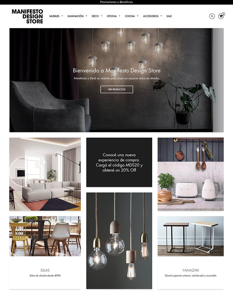
Loft from Trailblaze Media makes the list as the budget-friendly option that does not cut corners on mobile. Its promo banners, popups, and tiles, the reason to pick it, are built to display cleanly on a phone rather than overwhelming a small screen, so a sales-led store can push offers without hurting the mobile experience.
Mega menus and swatch filters keep products easy to find, and at the lowest price in this list it is an easy, mobile-ready starting point for a promotion-led brand that is watching its budget.
Loft for Mobile, Highlights:
- Promo banners, popups, and tiles that display cleanly on a phone.
- Mega menus and swatch filters for easy mobile discovery.
- The lowest price in this list.
- Best for promotion-led stores on a budget.
Loft Usage Statistics
Loft usage at a glance, from our Shopify store dataset, refreshed daily.
Booster
Ideal for: Cutting app costs

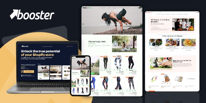
Booster earns a spot because its whole reason for being, turning browsers into buyers, is aimed squarely at the mobile shopper. Its sticky add-to-cart, countdown timers, and popups are exactly the nudges that matter most on a phone, where attention is short and checkout friction kills sales.
It bundles those tools into the theme instead of leaving them to apps, and it is sold direct rather than through the Shopify Theme Store. Fewer stores in our dataset run it than the Theme Store options above, so we do not show live stats for it, but for a conversion-first mobile store it packs a lot in.
Booster for Mobile, Highlights:
- Sticky add-to-cart, countdown timers, and popups tuned for mobile conversion.
- Bundles selling tools into the theme instead of apps.
- Aims to replace several paid apps to cut costs.
- Sold direct, with no Shopify Theme Store listing.
Booster Page Speed: Live Data
-
How do mobile Shopify themes handle online payments and checkout?
Shopify themes typically include streamlined online payments and secure checkout processes, optimized for mobile devices, to ensure a smooth and trustworthy payment experience for customers.
-
Do mobile Shopify themes offer multilingual support for global customers?
Yes, absolutely. Many mobile Shopify themes support multiple languages. These make it easier to cater to a global customer base and expand your market reach wider.
-
Can I use push notifications with mobile Shopify themes?
Some mobile Shopify themes allow integration with apps that enable push notifications, helping you engage with customers on their mobile devices and drive more traffic to your store.
-
Are all Shopify themes mobile-friendly?
Technically yes, every Shopify theme is responsive and adjusts to the screen. The difference is how well each one performs on a phone, from load speed to how easy the navigation, filtering, and checkout are on a small screen. That is what separates the themes on this list.
-
Which mobile Shopify theme is fastest?
Speed depends on your images, apps, and catalog, but Symmetry tests faster on Google PageSpeed than most themes we measure, and the others here are all built to load quickly. Each card links to live stats so you can compare speed and adoption directly.
-
Is there a cheap mobile-friendly Shopify theme?
Yes. Loft from Trailblaze Media is the most affordable premium option here and works well on mobile, with promo tools built in. If you want free, Shopify’s own themes like Dawn are fully responsive too, just with fewer built-in features.
-
What makes a Shopify theme good on mobile?
Fast loading, thumb-friendly navigation like a sticky header and slide-out cart, clear variant pickers and swatches, and conversion tools such as quick buy and a sticky add-to-cart. Together these keep a phone shopper moving from browsing to checkout without friction.
Conclusion: Choosing a Mobile Shopify Theme
If you want to rank well and sell to the shoppers who are already on their phones, a fast, thumb-friendly theme is not optional. Any of the picks above will serve a mobile-first store well, so match the choice to your catalog size and budget. For more options, see our full guide to Shopify theme reviews.