Shopify Store Examples by Industry and Their Themes 2026
Last modified: October 6, 2026
| # | Image | Name |
|---|---|---|
| 1 |
|
SKIMS
|
| 2 |
|
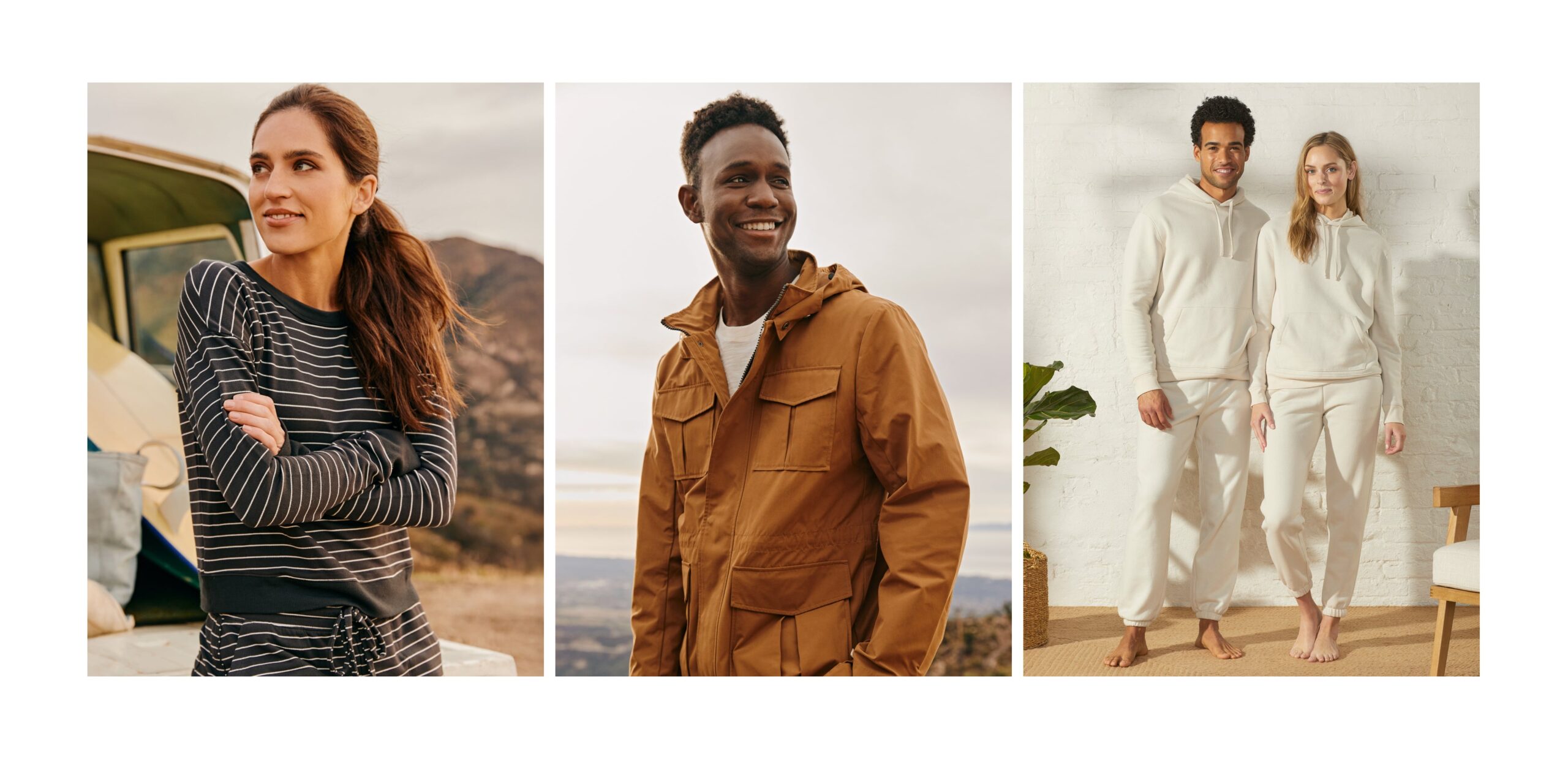
UpWest
|
| 3 |
|
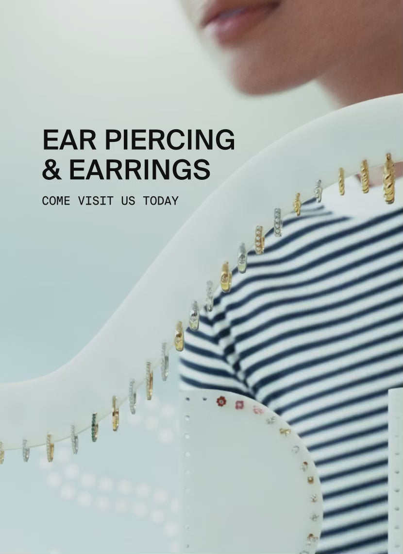
Studs
|
| 4 |
|
Hardgraft
|
| 5 |
|
Bokksu
|
| 6 |
|
Tessemae's
|
| 7 |
|
Mast Brothers
|
| 8 |

|
Pinrose
|
| 9 |
|
Salt & Stone
|
| 10 |
|
Goodee
|
|
Show More
|
||
Data first, opinion second: we track usage across 3.5+ million Shopify stores daily, and have since 2017. The stats tell us what merchants actually use; our editors rank the final picks by quality, pricing, and fit.
SKIMS
Industry: Apparel & accessories
SKIMS reads as luxury before you read a single word. The homepage hero runs a slow, full-bleed product video. Below it, a tight product grid with neutral tones (sand, taupe, espresso) and unembellished thumbnails. Sticky add-to-cart drawer follows you down the page. Every choice is restrained, which is exactly what a premium shapewear brand needs.
The store runs on Prestige by Maestrooo, a $400 theme built around editorial product storytelling and high-end aesthetics. Prestige’s slow-loading hero animation, full-bleed image blocks, and minimal navigation are all on display here. It’s the same theme Mast Brothers uses (also on this list) for an entirely different niche, which shows how much range Prestige has when you push it toward minimal versus indulgent.
SKIMS Design Highlights
- Restrained palette (neutral tones only) signals premium positioning
- Hero video communicates fit and movement better than static photography
- Sticky add-to-cart drawer keeps purchase intent within reach on long product pages
- Editorial-style category pages with model-led imagery, no flat lays
- Theme: Prestige (Maestrooo)
UpWest
Industry: Apparel & accessories
UpWest sells “thoughtful goods”: men’s basics, home textiles, and small accessories. The store reads warm and lived-in: hero shots of people on couches in joggers, copy that says “comfortable” without saying “comfortable.” It’s the rare example of a major brand pulling off a polished look on a free theme.
UpWest runs on Dawn, Shopify’s free flagship theme. The store’s custom theme name even includes “New Mobile Dawn,” confirming it. What UpWest proves: Dawn is enough if you bring real photography, brand voice, and merchandising discipline. The savings on theme cost can go straight into the assets that actually move conversion.
UpWest Design Highlights
- Warm photography and human-scale imagery on a free theme
- Category labeling (“thoughtful goods”) replaces generic “shop now” CTAs
- Sustainability badges integrated into product pages without being preachy
- Dawn’s free, fast foundation freed budget for content
- Theme: Dawn (Shopify, free)
Studs
Industry: Apparel & accessories (jewelry)
Studs is part ear-piercing studio, part jewelry brand, and the site has to support both. The homepage runs side-by-side modules: shop earring styles, or book a piercing appointment at a physical studio. Product pages use macro close-ups (essential because earrings are small) and stack stylist-curated “earscapes” so shoppers can plan multi-piercing looks. It’s a category that didn’t exist online a decade ago, designed natively for the web.
The store runs on Envy by Pixel Union ($350). Envy supports both service-style and product-style merchandising blocks, which is exactly what a hybrid retail/ecom brand needs. The booking widget integrates without looking glued on, which would be a bigger fight on a more product-only theme.
Studs Design Highlights
- Service booking and ecom coexist on the same site without competing
- Macro product photography solves the “small earring” problem
- Curated “earscape” sets merchandise multiple products as one look
- Studio locator integrated into homepage navigation
- Theme: Envy (Pixel Union)
Hardgraft
Industry: Apparel & accessories (leather goods)
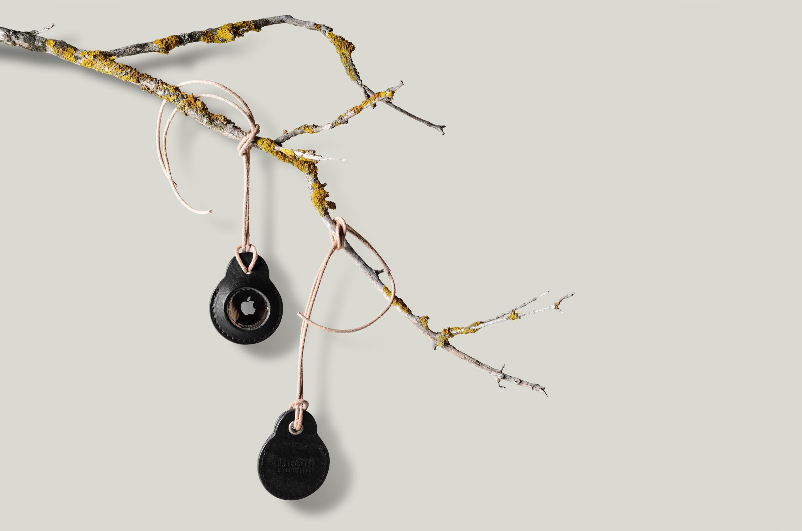
Hardgraft makes leather goods (laptop sleeves, wallets, weekenders) and treats every product page like a magazine spread. Long-form copy alternates with full-width lifestyle photography. Materials are described with the weight, tannery, and source country. The aesthetic is dark, considered, and almost zero in white space, but it works because the buyer is shopping for craft.
The store runs on Broadcast by Invisible Themes ($380). Broadcast is content-first: section blocks that mix image, video, and text, and a layout that supports long product narratives. It’s a poor fit for catalog-heavy stores, but a strong fit when your conversion lever is storytelling.
Hardgraft Design Highlights
- Long-form product descriptions with material sourcing detail
- Dark, considered palette signals “craft” without overdesign
- Image and text section blocks let products breathe
- Hero shots show product in use, not on white
- Theme: Broadcast (Invisible Themes)
Bokksu
Industry: Food & drink
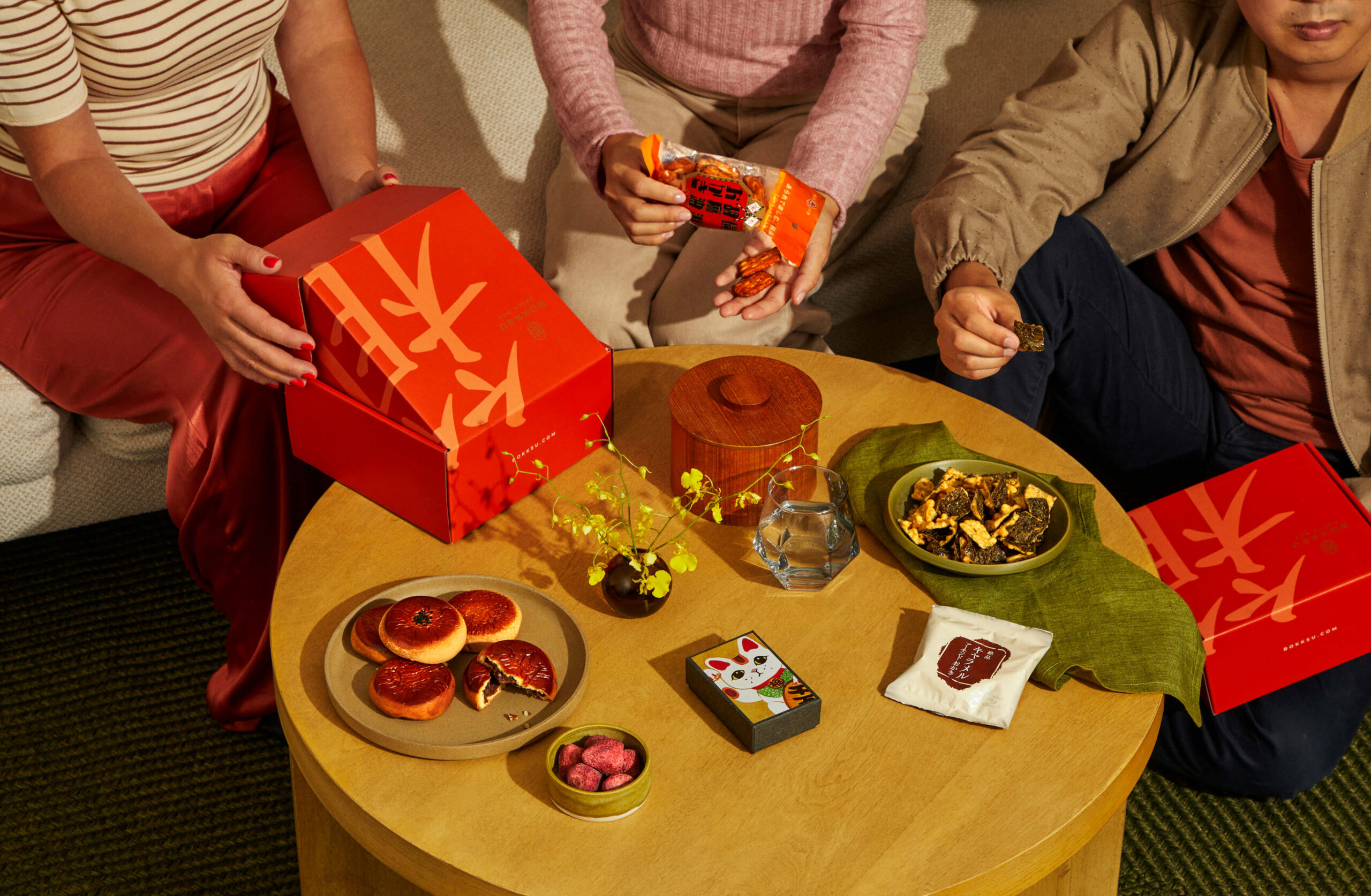
Bokksu sells a Japanese snack subscription plus a marketplace of 100+ imported foods, and the design has to handle both. The homepage opens with a story-driven hero (curated snack box of the month) and gives way to a deep marketplace below: filterable by snack type, region of Japan, and dietary restriction. Country-origin flags appear on every product card, which sounds small but is the kind of detail that makes a long-tail catalog feel personal instead of overwhelming.
The store runs on Expanse by Archetype Themes, a $420 theme purpose-built for large catalogs. Expanse’s multi-column mega menu, fast filterable collection pages, and quick-buy modals are visible everywhere on Bokksu. The custom theme name even includes “Expanse-Marketplace-Theme,” which confirms what the source code already shows.
Bokksu Design Highlights
- Subscription hero and marketplace coexist without crowding either out
- Filter sidebar handles 100+ products by region, type, and diet
- Country-origin flags on product cards add storytelling at the catalog level
- Quick-buy modals reduce clicks for repeat subscribers
- Theme: Expanse (Archetype Themes)
Tessemae's
Industry: Food & drink
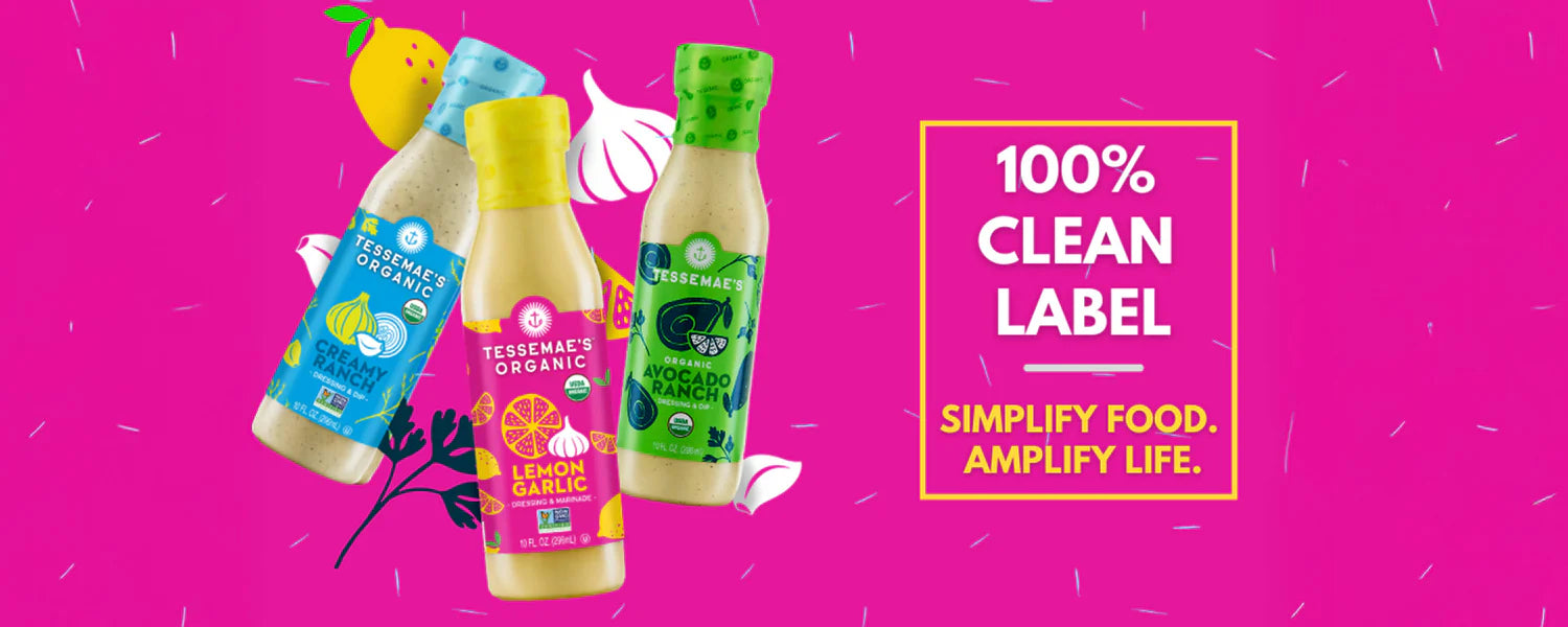
Tessemae’s makes Whole30-friendly condiments, and the store leans hard into that origin story. Warm cream backgrounds, hand-illustrated bottles, and copy that reads like a farmer’s-market sign rather than a CPG brand. The product grid uses lifestyle shots (a hand pouring dressing over a salad) instead of bottle-on-white, which makes a humble condiment line feel like it belongs in a high-end pantry.
The store runs on Blockshop by Style Hatch ($350), a theme built around editorial brand storytelling and lifestyle photography. Blockshop is less common on big-name lists, which is exactly why it’s worth studying. It handles small catalogs (Tessemae’s has fewer than 50 SKUs) with story-led collection pages that would feel awkward on a marketplace-style theme like Expanse.
Tessemae’s Design Highlights
- Warm, illustrated branding signals “small-batch” without being amateurish
- Lifestyle photography in product grids does more than bottle-on-white shots
- Story-led collection pages match the brand’s farmer’s-market voice
- Niche-appropriate theme: Blockshop suits artisan food brands well
- Theme: Blockshop (Style Hatch)
Mast Brothers
Industry: Food & drink
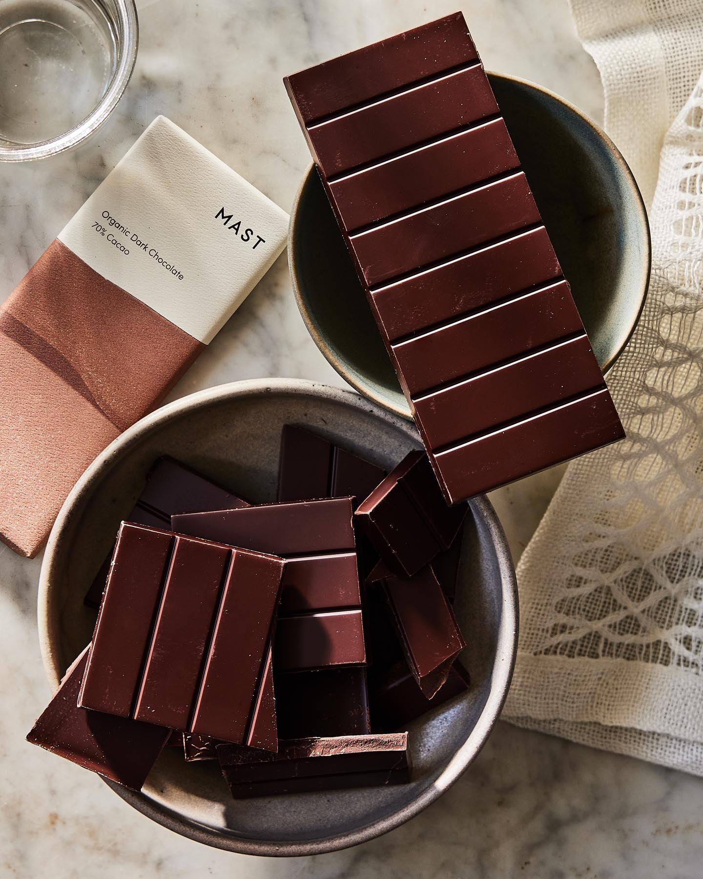
Mast Brothers sells craft chocolate, and the store treats every bar like an art piece. The packaging photography is the headline: high-contrast graphic wrappers, displayed full-bleed and rotated through hero slots. Collection pages group bars by origin (single-origin Madagascar, Tanzania, Peru) instead of by price or popularity, which lets the brand tell its sourcing story through navigation alone.
The store runs on Prestige by Maestrooo. SKIMS uses the same theme for shapewear, which is the proof of how versatile Prestige is when pushed in different aesthetic directions. Mast Brothers leans on Prestige’s full-bleed image blocks, magazine-style spacing, and indulgent type to make a humble chocolate bar feel like luxury.
Mast Brothers Design Highlights
- Wrapper-focused photography is the brand asset, not the product itself
- Origin-based collections turn navigation into storytelling
- Full-bleed image blocks and indulgent typography elevate a $10 product
- Same theme as SKIMS, in a completely different aesthetic register
- Theme: Prestige (Maestrooo)
Pinrose
Industry: Beauty & personal care
Pinrose sells niche perfume online, a hard category because shoppers can’t smell anything before buying. The store solves the problem with a scent-personality quiz front-and-center on the homepage. Take it, get matched to fragrance families, then see products curated to your result. Product pages use mood-board imagery instead of bottle close-ups, treating perfume the way a magazine would.
The store runs on Impulse by Archetype Themes ($450). The store’s custom theme name explicitly says “Impulse - W25,” confirming the theme. Impulse’s strengths show up clearly here: native quiz/finder support, promotional banners across multiple page templates, and gallery-style product imagery that doesn’t fight the brand’s editorial voice.
Pinrose Design Highlights
- Scent quiz on the homepage solves the “can’t smell it” problem
- Mood-board imagery treats perfume editorially, not commercially
- Product cards stack imagery and scent notes side-by-side
- Sample-set merchandising lowers risk for first-time buyers
- Theme: Impulse (Archetype Themes)
Salt & Stone
Industry: Beauty & personal care
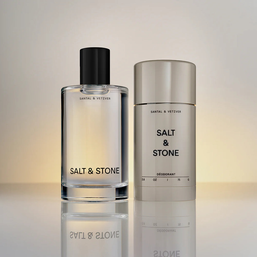
Salt & Stone sells clean-ingredient skincare and deodorant. The homepage is off-white, the photography is moody and dim, and the product close-ups are nearly tactile. Ingredient transparency is a hero, not an afterthought: every product page lists what’s in (and explicitly what’s out), with sourcing notes for the headline ingredients. The brand feels expensive without using a single luxury cliché.
The store runs on Dawn, the same free Shopify theme behind UpWest. Two stores on this list run Dawn, in different categories, both punching above the theme’s free price. The lesson: theme cost is not the bottleneck. Photography quality, copy discipline, and merchandising restraint are.
Salt & Stone Design Highlights
- Off-white palette and dim photography reframe “clean beauty” as premium
- Ingredient sourcing is editorialized on every product page
- Macro product photography makes texture and packaging tactile
- Dawn’s free foundation handles a luxury-positioned brand convincingly
- Theme: Dawn (Shopify, free)
Goodee
Industry: Home goods
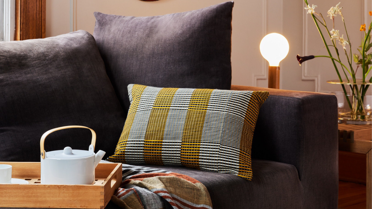
Goodee curates sustainable home goods from artisan makers around the world. The design is editorial in the truest sense: large lifestyle photography, designer bios on every product, and copy that reads more like a craft-design magazine than an ecommerce store. The collection pages alternate full-bleed imagery with text blocks describing each maker’s process. It works because the brand IS the curation.
The store runs on Symmetry by Clean Themes ($380). Symmetry’s signature is its editorial section blocks: large image+text combinations, gallery-style collection pages, and a navigation that supports long-form content alongside products. For a curator-style brand, Symmetry punches well above its price point.
Goodee Design Highlights
- Editorial layout makes curation feel like the product
- Maker bios on every product page build trust without forced “about us” copy
- Lifestyle photography is the hero, not flat product shots
- Long-form content blocks integrate with shopping flow
- Theme: Symmetry (Clean Themes)
-
What Shopify theme do most successful stores use?
There’s no single answer. Dawn (Shopify’s free theme) powers more successful stores than people expect, including Knix, UpWest, and Salt & Stone. Prestige by Maestrooo is the most common paid theme for premium-positioned brands like SKIMS and Mast Brothers. Larger catalogs tend toward Expanse or Impulse by Archetype Themes. Theme choice should match your category, not chase popularity.
-
How can I tell what Shopify theme a store is using?
Open the store in your browser, view the page source, and search for Shopify.theme. You’ll find a JSON object that includes a theme_store_id field linking back to the Shopify Theme Store. You can also use the ShopThemeDetector tool or the Shopify Detector Chrome extension to do this automatically by pasting any store URL.
-
Do the best Shopify stores use free or paid themes?
A mix. Of the 10 stores in this list, three (UpWest, Knix, Salt & Stone) run on Dawn, which is free. The other seven use paid themes ranging from $350 to $450. The pattern: free themes work when you invest the savings into photography and copy. Paid themes pay off when you need niche features like large-catalog filtering or service booking integrated into ecommerce.
-
What is the most expensive Shopify theme used by top stores?
Among the stores in this list, Impulse by Archetype Themes at $450 is the highest-priced theme, used by Pinrose. Warehouse, also by Archetype Themes, retails at $460 and is common among heavily customized enterprise stores. Most paid premium themes sit in the $350 to $400 range, including Prestige, Symmetry, Broadcast, and Expanse.
-
Can I make a free theme like Dawn look as good as a paid theme?
Yes, and the stores in this list prove it. UpWest, Knix, and Salt & Stone all run on Dawn and look indistinguishable from premium-themed competitors. What separates them is photography, brand voice, and merchandising discipline. The theme’s job is to not get in the way; the brand’s job is to fill the space well.
-
Why do some big Shopify stores hide what theme they use?
When a merchant heavily customizes a theme, Shopify sometimes nulls out the theme_store_id field in the public source. That doesn’t necessarily mean the theme was custom-built; it usually means the merchant duplicated and renamed a stock theme to lock in their version. Stores like Allbirds, SKIMS, and Fenty Beauty all have customized custom_name fields, but underlying theme fingerprints (asset paths, CSS class patterns) can still reveal the parent theme.
-
Which Shopify stores make good design examples to learn from?
The strongest examples are stores whose design clearly fits their industry, like SKIMS and UpWest in apparel, Bokksu and Mast Brothers in food and drink, Salt & Stone in beauty, and Goodee in home goods. Study the one closest to your category, then check the theme it runs so you can start from the same foundation.
What you can copy from these store designs
Pick the theme that fits the type of store you’re building, then study the example here that’s closest to your category. The expensive part of these designs isn’t the theme: it’s the photography, the copy, and the merchandising decisions. Theme choice gets you 30% of the way; the rest comes from how you fill it.
If you want a deeper breakdown of how each theme handles product pages, collection layouts, and checkout, our complete theme review guide covers each theme on this list in depth. For broader design principles that apply regardless of which theme you pick, see Shopify store design guide.
Conclusion
The most successful Shopify stores online aren’t running secret custom builds. Most use a theme you can buy today, then invest the saved development budget into photography, copy, and merchandising. Use this list as a shortcut: find a store whose design fits your category, identify the theme, and start there.