7 Best Mobile Shopify Themes 2026
Last modified: March 5, 2026

| # | Image | Name | |
|---|---|---|---|
| 1 |
|
Booster
|
|
| 2 |
|
Symmetry
|
|
| 3 |
|
Empire
|
|
| 4 |
|
Loft
|
|
| 5 |
|
Expanse
|
|
| 6 |
|
Beyond
|
|
| 7 |
|
Prestige
|
|
|
Show More
|
|||
Our rankings aren't just opinions. They are based on proprietary detection data from 3.5 million+ Shopify stores, aggregated daily since 2017.
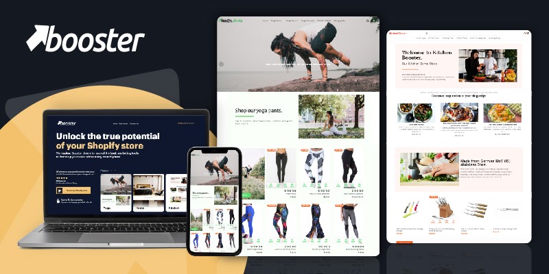
Booster

Booster is one of the most impressive themes that’s available for Shopify users. This is partly because it isn’t just a theme, it is a complete toolkit to help you improve the design of your website, and it is completely responsive, allowed to be used by visitors on any device. If you were to use the features within the theme, you can also save lots of money. The developers reckon that you can save about $3000 a year on app subscriptions. This is a lot for any business.
Some of the features that you can benefit from with Booster are the countdown timers, social proof, popup creators and live chat. All these features are known to help improve conversions on your website. Those that want to sell internationally can also benefit from the currency converter. You’re also able to use the included features to help grow your mailing list.
Booster is one of the fastest themes available on the Shopify website. Website speeds are often less than a second, which is very impressive, and customers will be pleased by the experience. This should help you to maintain high sales and improved business performance.
Booster Highlights:
- The coding in this theme has helped it to become one of the fastest themes that can be used for your Shopify website.
- Perfect for SEO with some of the best improvements to help you rank high.
- It is a completely mobile-friendly website, allowing your site to be seen on whatever device customers are using.
- Save up to $3000 a year on apps by using the included features.
Symmetry
Symmetry is one of the most responsive themes that you can use to make your website look sleek, modern and trustworthy. Visitors to your website can be impressed by the general design, and you can expect to see some great returns. This theme is perfect for those that want to create a fast website that will also rank on Google and other search engines. And when customers find their way to your website, their experience will be second to none as they explore with great speed and a visual appearance that is pixel perfect on any device.
There are lots of features that have been added to the coding of this theme to help you convert more of the visitors to your website. For example, there is a multi-level menu option that allows you to build a website that looks aesthetically pleasing while being easy to navigate. Customers will be able to get anywhere on your website with just a few clicks. The experience can be further enhanced with a fantastic ‘quick buy’ function. This is very similar to how Amazon works.
There are lots of options that can help you integrate your store into social media. For instance, there is an Instagram feed that will list your latest posts on the social media channel to your website. This is a great way to attract the attention of users and get them to follow you on social media.
Symmetry Highlights:
- This is a mobile-friendly theme that will look perfect for customers and others.
- There are free stock images that are available from Burst for you to use on your website.
- Advertise your products on social media with lots of integrated social media apps and functions.
- There are four styles that you can use when you’re building your website for the first time.
Empire
Empire is another great theme that has a lot to offer those who want to have a highly responsive website for their business. There are three great theme styles that can be used to create the basic design for your website. These can then be customized with lots of available options available. The finished result can be a mobile-friendly website that will impress guests and earn you sales. You’ll also be able to match website design with that of your offline branding.
The theme was built for stores that have numerous products, and it can help customers to find the right product for them. Features that help this includes a predictive search feature that can help customers as soon as they start to type. In addition, there is a product filtering system that can help improve the shopping experience.
There is also a quick buy option that allows customers to move from the product page to the checkout page seamlessly. This little feature can really help reduce abandoned carts.
Empire Highlights:
- This theme has been optimized for both mobiles and search engines, allowing you to attract the best traffic.
- There are free images available via Burst to help you give a professional image to your website.
- Use the quick buy option that can help speed up the shopping experience of your customers.
- There are lots of great options to help customers find the products they want, including filtering and predictive search.
Loft
Loft is one of the best options if you’re looking to start a new Shopify website that will be friendly to mobile devices. This theme has the capacity to handle a large catalog with ease, and you can have varieties with those products without affecting the performance of the website. The theme is based on a storytelling mode, this allows you to build a strong emotional pull with the audience. Part of the brand’s story can also be shared through the embedded Instagram feed.
There are lots of options to help you sell more on your homepage. For instance, there are special promotional tiles that allow you to highlight the best products on your website. This can include products that are best-selling or are on offer. There are also multi-level menu options that can help visitors to find their way around your website.
The theme is one of the best for designing as well. Changes can be made with ease as you rank highly on Google and other search engines. The theme also includes great high-resolution image capacity, allowing you to showcase your best products.
Loft Highlights:
- One of the top themes for those who want to host a lot of products on their website.
- Create a store that can build an emotional pull with the Instagram feed.
- You can use high-resolution images that can help give more detail about products.
- This is one of the best themes for mobile users and ranking on Google.
Expanse
Expanse is one of the best options for those that want to list and sell their products direct from their homepage. Customers can see a product on the first page they land upon and then use the intuitive and easy-to-use quick buy button to add the products to their cart. They don’t need to visit the product description at all.
The theme also enables you to cross-promote collections by using custom collection tiles within other collection pages. This is great for growing the average cart order value on your website. It can also be used for promoting sales, discounts and highlighting the best products on your website.
Navigation and product discovery is also really important on the theme. There is a homepage menu list that can help customers navigate around your catalogs and website. There are also custom collection sidebar filters to help customers making purchasing decisions.
The theme also helps customers to arrange collections from your store.
Expanse Highlights:
- Is perfect for those brands that want to have a mobile-friendly website.
- Promotes sales, discounts and more products within a promotional tile design.
- Allow local pickup of orders on your website.
- Is perfect for brands who want to have an easy-to-customize website.
Beyond
Beyond is one of the top themes that is great for mobile use. There are numerous features that can help brands of all sizes to find and sell to customers. You’re able to build a brand around a story that features a video right on your homepage. You’re also able to use videos on your product pages. This has been found to help improve website conversions.
To help sell, there are also collection page promotions. This allows you to create custom promotional content on a collection page. This can draw the attention of your visitors to specific content you would like them to see. This should improve the sales of specific products that you would like to sell. When customers do want to make a purchase, then can use the ‘quick buy’ option.
The theme includes a predictive search. This will display the live search results and also provide quick links to help customers get to the right product they would like. Navigation is also important with a multi-level menu that has a dropdown design.
Beyond Highlights:
- There’s a multi-level navigation support on your website for better movement across your website.
- Customers can easily find the products that they want with the predictive search.
- Perfect for many different brands and industry niches.
- Is completely mobile-friendly.
Prestige
Prestige is one of the top themes for those that want to have a good mobile-friendly website. It will work with all the best Shopify features and the latest ones that are released. The theme will also remain up-to-date. The theme itself has been tested for speed and its responsiveness and has passed well, according to Shopify. Therefore, you should be able to rank high on Google and other search engines.
The design is very traditional, but that doesn’t matter as the aesthetic appearance is really nice. It also allows you to showcase your website’s products in great detail. Customers can be automatically drawn to your best products, and they can see more details about them from the homepage. There are also great product/shop pages that can be utilized to help customers shop on your website.
Prestige Highlights:
- Use free images supplied by Burst to help you populate your store with professional media.
- A rather traditional design that is perfect for many niches.
- Promote the best products you have to offer on your homepage.
- Perfect for ranking on Google and displaying on any device.
-
How do mobile Shopify themes handle online payments and checkout?
Shopify themes typically include streamlined online payments and secure checkout processes, optimized for mobile devices, to ensure a smooth and trustworthy payment experience for customers.
-
Do mobile Shopify themes offer multilingual support for global customers?
Yes, absolutely. Many mobile Shopify themes support multiple languages. These make it easier to cater to a global customer base and expand your market reach wider.
-
Can I use push notifications with mobile Shopify themes?
Some mobile Shopify themes allow integration with apps that enable push notifications, helping you engage with customers on their mobile devices and drive more traffic to your store.
Maximizing Mobile Performance with Shopify Themes
Essential Features for Mobile Optimization
Top mobile Shopify themes prioritize responsive design for seamless viewing on all devices. They focus on speed optimization to enhance user experience and reduce bounce rates, crucial for mobile users who value quick access.
User-Friendly Design and Navigation
User-friendly design is key in mobile Shopify themes. They offer intuitive navigation and easy-to-use interfaces, ensuring customers can find what they need, which is vital for maintaining engagement on smaller screens.
Enhanced Shopping Experience
These themes enhance the shopping experience with features like quick view options, dynamic filtering, and easy checkout processes. This leads to a smoother journey from browsing to purchasing, essential for capturing mobile sales.
Driving Sales and Engagement on Mobile Devices with Shopify Themes
Optimized for Speed and SEO
Mobile Shopify themes are optimized for speed and SEO. Fast-loading pages improve search engine rankings and user satisfaction, crucial for attracting and retaining mobile shoppers.
Customization and Flexibility
Highly customizable themes allow for unique brand expression on mobile devices. They offer various layouts and design options, catering to diverse business needs and enhancing brand identity.
Smart Sales Features
Themes include smart sales features like popups, quick buy options, and advanced product displays. These tools are designed to boost conversions and enhance the mobile shopping experience.
Conclusion: 7 Best Mobile Shopify Themes
If you want your website to rank well on Google and to be seen by all customers, then you will want to be using one of the best mobile Shopify themes. You might also like custom products or blog themes. Browse more best themes by style that you can use. Which of the themes will you use?
